Data Visualization Consulting Services

Data exists for enterprises, yet most can’t see or act on it because insights that matter are buried under complex, raw data no-one can make sense of.

Algoscale’s data visualization services transform this chaos to visual clarity, making it easy for you to spot trends that matter and make the right decisions at the right time with data stories that make sense to the analyst and non-technical team members alike.

Algoscale is trusted and loved by –

Deduction in decision-making time
0 %
Reporting Speed
0 x
Data Sources Integrated
0 +
Rows Processed Monthly
0 B+
Dashboard Uptime SLA
0 %

The Problem Landscape.

We work with organizations that are genuinely trying. They’ve invested in BI tools. They’ve hired data teams. They’re collecting more data than ever. Yet somehow, the data still isn’t moving through the needle.

Here’s what we’ve learned: most companies don’t have a data problem. They have a visualization problem. And they don’t realize it until they’ve already built half a dozen dashboards nobody uses.

If this resonates, you’re not alone. These are the four places most organizations get stuck in.

Data Lives in Silos

Your data isn’t in one place. It’s scattered across various data sources. Every team has its own dashboards, its own “truth”, and their own way of reporting numbers.

So, when leadership needs a complete picture, it takes days of manual effort just to piece things together.

The Algoscale Impact: We unify your data into a single, trusted view of your business.

Stakeholders Are Speaking Different Languages

Your CFO wants to see P&L trends and cash flow projections. Your marketing leader needs customer acquisition costs and conversion funnels. Your operations team is tracking SLA compliance and production metrics. Meetings turn into debates and decisions get delayed.

The Algoscale Impact: We standardize your metrics and design visualizations that speak one language, across all stakeholders:

Decision-Making Paralysis

You’re tracking everything but prioritizing nothing. Critical signals are buried under hundreds of metrics. By the time insights surface, the opportunity is already gone.

The Algoscale Impact: We design dashboards around decision moments, not data volume

Dashboards Nobody Uses

You’ve built impressive dashboards. Technically solid. Visually sophisticated. But adoption is stuck at 15-20%. Teams don’t use them because they’re too complex, too slow, or they don’t answer the questions people actually care about. So, everyone goes back to Excel. Back to email. If adoption fails, you’ve wasted the investment and lost the competitive advantage.

The Algoscale Impact: We focus on improving dashboard usability by building intuitive, high-performance dashboards designed for real users, not just analysts.

Most organizations face all four of these problems at once. They’re connected. Data in silos leads to language confusion, which leads to decision paralysis, which kills adoption.

Which of these is costing your organization the most right now?

The Transformation Journey.

From Chaos to Clarity: The VIVID Framework
Every organization we’ve worked with follows the same transformation. It’s Algoscale’s methodology. We call it VIVID – our framework for turning your scattered data into strategic decisions.
VIVID isn’t just a process. It’s a philosophy. It’s how we think about data visualization. And it works because it’s built on five principles that actually matter for your data storytelling strategy.

Data Clarity & Discovery

You can’t transform what you don’t understand. In this phase, our data visualization consultants audit your entire data landscape. What systems do you have? What data quality issues exist? Where are your biggest opportunities? What patterns are hiding in plain sight? VISUALIZE ensures we’re solving the right problem.

What You Get

Unified Data Architecture

Now that we understand your data landscape, we as your data visualization consulting company architect the solution. This is where your data sources come together. Your CRM talks to your finance system. Your operations data connects to your customer data, and all the pieces fit together. We build infrastructure that makes everything possible. The data pipelines. The models. Governance. The foundation that every visualization sits on.

What You Get

Business Outcome Alignment

Every dashboard, every visualization, every metric serves a purpose. We build it because it drives decisions. Our data visualization services are designed around decision moments. What does your CFO need to see to finalize a budget? What does your sales leader need to see to shape strategy? We answer those questions. And this is where visualization becomes storytelling. Data becomes a narrative. Numbers turn into action.

What You Get

Continuous Optimization

Launch day is exciting. Our data visualization experts monitor how your teammates are using the dashboards. We optimize based on reality, not assumptions. We refine visualizations. We simplify the complicated data. We surface what matters and retires that no one uses. This phase never ends. As your business evolves, your visualization evolves with it.

Organization-Wide Adoption & Excellence

This is where transformation becomes culture. We’re not just giving you dashboards. We’re changing how your organization makes decisions. Our data visualization consultants train your team. We create rituals around the data, ensuring enterprise-wide adoption follows interactive dashboard development. We communicate wins. We build confidence that data actually matters.

Our Data Visualization Services.

Enterprises don’t lack data or dashboards. What they lack is the ability to identify meaningful patterns from a sludge of data, accelerate decisions, and drive alignment across every layer of their organization with a universal data language. This is precisely what our Data Visualization Services help you do. Explore the full suite.

Data Visualization Consulting, Strategy, and Audit

It’s the same story with enterprises whose dashboards have nothing to do with them- dashboards get built without any clarity on which questions they should answer and who is going to use them. The result is delayed decisions with trapped data and teams struggling to decode the same.

Our Data Visualization Consulting Services address this gap, assess your current analytics landscape, data maturity, identify key business questions, define KPI frameworks and governance models to help you identify priorities for data visualization, choose the right visualization type, and deliver a strategy that brings your team closer to the data (irrespective of their technical expertise).

Data Source Integration and Pipeline Setup

In order to get accurate data to drive critical decisions, all your data sources should talk to each other, add up at the time of decision-making, and drive clarity by not overwhelming your team with different or partial versions of truth.

We eliminate data silos from CRMs, ERPs, cloud warehouses, APIs, and flat files into a unified and reliable layer ready for visualization. Having successfully integrated 65+ data sources, we help you seamlessly connect your data sources, ensure seamless data flow for decision-ready intelligence, and drive team confidence by making accurate data accessible when it matters most.

Data Cleaning and Transformation

Having data and using that data as an enabler for decision-making are two different things. Decision-ready data cannot have conflicting metrics definitions, duplicate values, and tell different stories to members of the same team.

Our enterprise data visualization helps you build a single source of truth by cleaning and transforming raw data into actionable insights by standardizing metrics definitions, so different teams do not define revenue, net sales, closed accounts, or other business concepts in different ways, resolving duplicates, and handling missing values for clarity that empowers at scale.

Data Storytelling Services

Raw numbers, even if they are accurate and accessible, have a lesser impact on your team than stories. If your sales team needs to analyze 10,000 rows of sales data and find a pattern about region-specific performance, they’d take thrice the amount of time and still miss a key insight trapped in the monotony of a spreadsheet.

Our data storytelling services make this process easy for your team. The same data is transformed to a narrative that gives them the entire picture. We transform data outputs into intuitive narratives to deliver insights to technical and non-technical stakeholders alike. From choosing the right chart type to layout and annotation guides, we take you from data to insight without adding to your cognitive load.

Advanced and Custom Visualization

We’ve had many enterprises come to us with the same question- how to design effective business dashboards- and expect a magic formula to make their traditional BI investments work.

Most of them needed to rethink their visualization requirements altogether. They had complex, non-standard data, the need for granular and deeper insights, and high-performance rendering. Our advanced visualization gave them interactive geospatial mapping, dynamic network graphs, hierarchical tree structures, multi-dimensional scatter plots, and real-time streaming dashboards tailored to data types- something traditional BI could not deliver.

BI Tool Migration and Optimization

Most enterprise continue operating with limitations while fearing that migration from legacy BI tools to scalable platforms will disrupt operations or compromise their data.

Our BI tool migration eliminates that concern and aligns your enterprise with its true data potential by ensuring a seamless transfer, validating end-to-end data before anything is pushed live, and ensuring legacy format incompatibility with modern systems does not add up costs. Whether you need Tableau Consulting services, need to migrate to Power BI, or Looker, we guarantee seamless transitions by consolidating redundant dashboards, tuning performance for faster load times, and enhancing data models, so your BI ecosystem delivers insights in minutes.

Custom Report and Dashboard Development

Enterprises don’t need more data or dashboards. They need tools that enhance their intelligence and make data accessible to their teams in the language they understand. This is what our custom reports and dashboards enable you to do.

We design custom dashboards and reports as part of our data visualization solutions. These are role-based, decision-ready, and built around how teams think. No more abandoned dashboards or complex reports that make no sense- just visually accessible intelligence tailored to the person, data type, and decision it caters to.

Data Visualization as a Service

Managing business activities that generate large volumes of data is demanding in itself. Transforming that data into intuitive visual narratives shouldn’t be so demanding.

Our Data Visualization as a Service streamlines this demanding, but necessary task for your enterprise by delivering end-to-end design, development, and maintenance of impactful dashboards and reports. Our scalable approach to transform data and prepare data stories ensures continuous updates, performance optimization, and seamless integration, so your teams always have real-time insights, consistent reporting, and the flexibility to adapt as data volumes grow.

Data Visualization Optimization

As your business scales, your data evolves. Just because you can read and interpret a dashboard today doesn’t mean it won’ need optimization when your data complexity grows, business use cases evolve, decisions become layered, and users want more to match their pace.

As a data visualization consultancy, we help you ensure that your data visuals not just adapt to growing needs but help you team make better decisions with faster load times, sharper insights, and a smoother user experience that drives focus to what matters.

We Speak Your Business Language.

healthcare tableau consulting services
Healthcare

Data defines how well healthcare is delivered to save lives. Healthcare data visualization transforms complex clinical, operational, and patient data into fast and actionable insights. This is beneficial for healthcare frontline professionals whose cognitive loads are amongst the highest in any profession; and every minute counts when they make life-saving decisions processing every parameter at one go. We help you accelerate their decision-making speed and efficiency with:

finance tableau consulting services
Finance & Banking

In financial services, decisions move markets, yet fragmented, high-volume data often slows insight and multiplies risk. Our finance data visualization transforms complex financial, transactional, and risk data into clear, real-time intelligence, enabling faster decisions, stronger compliance, and sharper competitive advantage in a high-stakes environment. We help you turn data into decisive action with:

manufacturing tableau consulting services
Manufacturing

In manufacturing, data is generated at every stage, but yet production and equipment data have nothing to do with on-floors data. Data visualization eliminates these silos and transforms complex production, supply chain, and operational data into real-time, actionable insights, enabling faster decisions, improved productivity, and tighter process control. We help you turn shop-floor data into performance gains with:

Insurance tableau consulting services
Insurance

Insurance data equally carries opportunities, risks, and challenges. Vast and siloed data makes it difficult to assess risk, detect fraud, and respond quickly to customer needs. This compromises trust it took years to build in a week. Insurance data visualization transforms complex policy, claims, and risk data into clear, actionable insights, helping insurers make faster underwriting decisions, improve claims processing, and manage risk with confidence. We help you achieve this efficiency with:

Types of Data Visualizations We Specialize In.

Visualization for Every Insight Type
Not all data tells the same story. A sales trend needs a different visualization than a customer journey. A risk metric needs a different approach than a performance comparison. This is where most visual analytics services stumble. They have one toolkit. We have many.
We specialize in different visualization categories. Each one serves a purpose. Each one serves a purpose.
Here’s what we built.

Executive Reporting Dashboard & KPI Tracking

The 30-second dashboard. High-level metrics at a glance. A CEO opens it and in 10 seconds know: are we on track or off track?

Operational Performance Dashboards & Real-Time Monitoring

The control room view. Live operational metrics. What’s happening right now? Which machines are running? Which orders are being fulfilled? Spot your problems instantly take action.

Analytical Dashboards & Deep Exploration

The analyst’s playground with our data visualization consulting expertise blended. Multi-dimensional data. Filters everywhere. The ability to dig deep, slice the data different ways, and discover patterns.

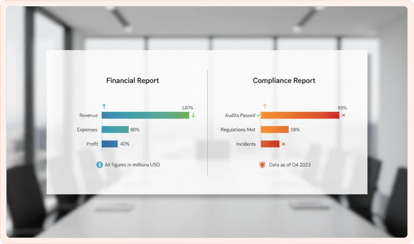
Financial & Compliance Reporting

The auditable view. Every number is traceable, and every calculation is documented. Governance and compliance built into the dashboard. You get P&L, budget variance, and cash flow tracked with precision.

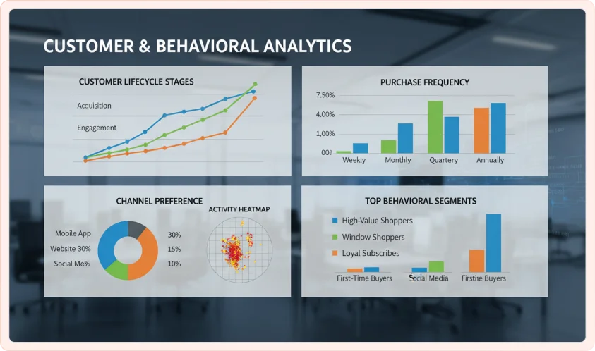
Customer & Behavioral Analytics

The customer's story was told visually. How do customers move through your funnel? What is their journey? Where do they drop off? Get to know which segments are most valuable for your business.

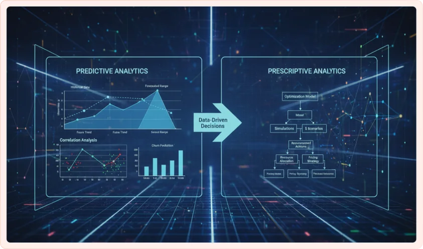
Predictive & Prescriptive Analytics

The forward-looking view. Not just what happened but also get to know what’s likely to happen? And even what should your business do about it. Predict trends, anticipate problems or forecast demand.

Geospatial & Location-based Visualization

Data on a map. Regional performance. Distribution of customers, inventory, or assets. Get geographic patterns that are instantly visible. Understand better your market geography.

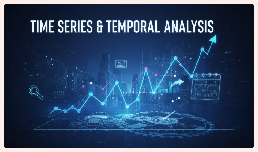
Time Series & Temporal Analysis

The storyteller of the change. How has X evolved over time? Get to know the trends that are emerging, and what are the inflection points? Understanding history informs future decisions.

Build Your Ideal Solution.

Every organization is different. Your data is unique. Your challenges are specific and your timeline matters. So why would a cookie-cutter solution work for you?
Below, answer the four quick questions. We’ll build your ideal data visualization roadmap in real time. Get clarity on what your business actually needs.

STEP 1: WHAT’S YOUR PRIMARY CHALLENGE?

Choose the one that hurts the most right now:

STEP 2: WHAT’S YOUR DATA VISUALIZATION MATURITY LEVEL?

Be honest about where you are:

STEP 3: WHAT’S YOUR TIMELINE?

When do you need results?

STEP 4: WHICH TOOLS ARE YOU USING OR CONSIDERING?

(Choose all that apply)

Your Data Storytelling Strategy Is Ready
Based on your responses, your organization is ready to move from fragmented data and underused dashboards to a clear, decision-driven data environment.

The real opportunity isn’t just better dashboards; it’s building a system where every visualization drives action, every metric has context, and every stakeholder sees the same truth.

This is what effective data visualization as a service looks like.

Your Full Data Visualization Strategy (Locked)
Your personalized roadmap includes:
• A recommended implementation approach tailored to your business
• A step-by-step execution plan focused on decision-making
• A clear timeline with delivery milestones
• What’s included in your data visualization consulting services engagement

Estimated Investment Range:
$XX, XXX – $XXX, XXX (based on your data complexity and scale)

See your complete roadmap, including exact approach, timelines, and investment clarity.

How Organizations Like Yours Are Making Better Decisions.

Built on Proven Expertise.

Tools bring your data stories to life. The choice of a tool should happen around your use case, data needs, and decision velocity.
At Algoscale, we bring vendor agnostic tool expertise tailored to your team, infrastructure, and scalability requirements, so you never have to compromise with a tool that doesn’t work for your business.

Tableau

Our Tableau expertise is built around transforming the idle and forgotten subscription in most enterprise environments to the highest ROI and team performance booster. Whether it is data modeling or advanced visual design, we help you avoid common pitfalls like over-engineered dashboards that compromise performance and create intuitive, high-impact visualizations for clarity, speed, and business value.

Microsoft Power BI

Our Power BI consulting services help you build a reliable analytics foundation with scalable data models, centralized KPI definitions, row-level security frameworks, and performance-optimized dashboards. Whether it is data optimization, data modelling, or Power BI integration and customization, we help you transform fragmented data into a reliable single source of truth with best-in class data visualization and intuitive dashboards that enhance access to insights.

Looker

Algoscale’s data visualization experts bring deep expertise in Looker’s semantic modeling layer (LookML) and help you build a governed data foundation while avoiding common pitfalls like a poorly architected LookML model with overlapping definitions, inconsistent dimension naming, or ungoverned metrics, which double the metric disagreement problem Looker is designed to solve, ensuring your enterprise gets a reliable single source of truth.

QlikSense

We bring deep expertise in Qlik Sense, leveraging its associative data model to uncover hidden relationships and enable truly interactive exploration. Our team ensures the platform is used to its full potential and enables efficient data modeling, optimized performance, and meaningful self-service analytics. We avoid common pitfalls like cluttered interfaces or poorly structured data to deliver intuitive, high-performance dashboards that deliver fast, flexible, and insight-driven decision-making.

Amazon QuickSight

Our Amazon QuickSight expertise helps you leverage its cloud-native architecture for fast, scalable, and cost-efficient analytics. Our team ensures you get maximum value by optimizing SPICE usage, managing costs effectively, and aligning deployments with your AWS ecosystem. We avoid common pitfalls like inefficient data models or slow dashboards, focusing instead on lightweight, high-performance visuals that deliver real-time insights with minimal overhead.

What Sets Algoscale Apart.

There are a lot of data visualization consulting services out there. We’re different in six ways that matter.

We architect data ecosystems, not just dashboards

Most visualization service providers build dashboards. We fix foundations. We audit your entire data stack, ETL processes, warehouse architecture, data quality, integration points. Because visualization is only as good as the data feeding it. Bad data architecture means dashboards fail under scale. We design scales from day one.

Data engineers build technically perfect dashboards nobody uses. UX designers create beautiful interfaces that break up complexity. We do both for custom dashboard development. Our team integrates architects, designers, and developers. The result? Dashboards that perform at 10,000 rows and work for both executives and analysts.

Our definition of success is different. Did adoption exceed 70%? Are decisions being made faster? Is the business actually moving forward?

We’ve intentionally walked away from engagements where the requirement was to build 40 dashboards, when the business truly needed four. Successful data visualization for business insights does mean more dashboards= more value. This often leads to low adoption and missed outcomes. We prioritize impact over volume. Because your success defines our reputation.

Most BI consultants only touch the BI tool. Our certified data visualization consultants optimize across Snowflake, BigQuery, dbt, Airflow, Kakfa, and your BI platform. We design data models for analytics, implement quality monitoring at source, and build metadata frameworks. Your visualization is as fast as your pipeline.

Exploratory dashboards let analysts ask any questions. Decision dashboards answer one critical question in 30 seconds. We design your actual decision moments. Every element has a purpose. Every color serves the story.

Our team has spent years in financial services, healthcare, retail, and tech. We know industry patterns, regulatory requirements, and what metrics matter. Most data visualization services are vertically agnostic. We’re vertical specialists.

Other visualization vendors are good at one thing. But Algoscale, as your data consulting services provider combines them all, the technical depth, UX design, industry expertise, governance, adoption strategy, long term partnership. That’s why it works. 

What Our Clients Say About Us.

VISUAL ANALYTICS PLAYBOOK.

We are giving away the playbook. But here’s what is interesting. Most organizations we work with already have this knowledge. They know what good visualization looks like. They know the principles. They know the best practices.

The problem isn’t knowledge. The problem is execution.

What this playbook contains:

This is the guide we use internally. It’s 30 pages of:

Reading this playbook won’t transform your organization. Executing it will. That’s why we’re giving it away. The playbook shifts how you think. That shift is where transformations start.

Fill this simple form; The playbook is on its way.

Data Visualization Strategy Assessment.

Please fill in your details below:

Once submitted, you’ll receive a confirmation, and our team will be in touch within 1–2 business days.

Technology Stack & Integrations.

We work with a modern, flexible technology stack to ensure your data visualization solutions are scalable, secure, and seamlessly integrated into your ecosystem. From data pipelines to front-end dashboards, we choose the right tools that align with your business needs.

BI & Visualization Tools

Platforms used to create interactive dashboards and reports for business insights.

Tools:

Programming & Frameworks

Languages and libraries used to build custom data visualizations and applications.

Tools:

Cloud Platforms

Infrastructure that enables scalable, secure storage and processing of data

Tools:

Integrations

Connectors that enable seamless data flow between different business systems and sources

Tools:

Databases & Warehouses

Systems used to store, organize, and query structured and unstructured data

Tools:

Real-Time & Streaming

Technologies that process and visualize data instantly as it is generated

Tools:

Data Engineering & Processing

Tools that clean, transform, and prepare raw data for analysis

Tools:

Engagement Models & Flexibility.

Choose How We Work Together
Your data. Our expertise. Your preferred model, tailored to meet your budget, timeline, and project-specific needs.

Project-Based

Have a clearly defined scope and the “why” of your data visualization sorted? This model is for you- whether it’s a fixed project need or a specific dashboard type, we help you manage it seamlessly within its specified timeline.

Dedicated Team Model

Need on-demand access to visualization engineers or data analysts for simplifying complex data visuals? Our dedicated team model helps you upsize or downsize your data visualization team size based on project scope, giving you unmatched flexibility for evolving project scopes and in-house skill gap supplementation.

Advisory or Strategic Consulting

Just starting on your data visualization and BI journey and need time-tested tips to wade early waters? From covering implementation basics, data readiness, identifying and defining KPIs that matter, and selecting the right BI tool for your use case, our strategic consulting covers it all.

Managed Services

Need data visualization benefits minus the headache? Our managed services cover end-to-end implementation, support, and continuous improvement of BI environments through ongoing performance optimization to ensure your decision-making engines evolve with data.

Your data doesn’t just need a medium where you can see it all. That’s a given.

It needs an engine that delivers the right insight at the right time, helps your team identify a meaningful pattern by joining the right dots, and making decisions that count.
All of this is possible if you have the means to cut through the clutter.
Algoscale’s data visualization services help you do just that.

Frequently asked questions.

All your questions related to Data Visualization answered to help you unlock its complete potential for your organization.

1. Which is better for enterprise dashboards- Power BI or Tableau?

Power BI is ideal for organizations already using the Microsoft ecosystem. It offers seamless integration with tools like Excel and Azure, is cost-effective, and works well for standardized reporting and quick deployment across teams. 

Tableau, on the other hand, excels in advanced data visualization and exploratory analytics. It’s better suited for handling complex data, creating highly interactive dashboards, and enabling deeper data discovery for analysts and decision-makers. 

Data Visualization as a Service (DVaaS) is a managed offering where experts design, build, and maintain dashboards and reports for your business, eliminating the need for you to invest heavily in tools or in-house teams. 

You get end-to-end support: from data preparation and visualization design to performance optimization and ongoing updates. DVaaS helps turn complex data into clear, interactive visuals, enabling faster insights and better decision-making while keeping your analytics scalable and cost-efficient. 

Algoscale is the best data visualization consulting company because we don’t just build dashboards. We engineer the entire data ecosystem behind them. By combining data engineering with UX design, we create solutions that are both powerful and intuitive. Our focus goes beyond volume to real business impact, ensuring high adoption and faster decisions. With deep expertise across modern data stacks and industries, Algoscale delivers scalable, purpose-built visualizations that truly drive outcomes. 

A data visualization company helps turn raw, complex data into clear, meaningful visuals that support better decision-making. But it’s not just about charts and dashboards. 

They typically work across the entire pipeline—understanding business goals, preparing and structuring data, designing intuitive visuals, and building interactive dashboards or reports. Many also optimize performance, ensure data quality, and integrate with your existing systems. As such, they make data easy to understand, accessible to the right people, and useful for driving real business outcomes. 

Data visualization consulting costs vary based on project scope, complexity, and expertise. Most consultants charge $50 to $150 per hour, while senior specialists may charge $150 to $300+ per hour. Project-based pricing typically ranges from $2,000 to $10,000 for simple dashboards, $10,000 to $50,000 for mid-sized projects, and $50,000+ for advanced or enterprise solutions. 

Companies hire data visualization consulting firms to transform complex data into clear, actionable insights. These experts design intuitive dashboards and reports that improve decision-making and help teams quickly understand trends and performance. They bring specialized expertise in tools like Power BI and Tableau, saving time and reducing the burden on internal teams. 

Top AI Development Company BusinessFirms Certified Company WADLINE Software Badge Top Software Developers New Jersey Software Development Companies Top Custom Software Development Companies 2026 Top Software Outsourcing Companies USA BI & Big Data Development Leader 2025 Artificial Intelligence Company of the Year 2025

Build AI-Powered Solutions. Let’s Turn Ideas Into Impact.

Get a custom proposal in under 1 hour.

plus 10% off your first project. Just fill in a few quick details and we’ll take it from there.

Once submitted, our team will be in touch within 1–2 business days.