R Against Tableau for Data Visualization.
With the right image, it becomes easy to influence an organization’s upper hierarchy in seconds. Data visualization tools transform the jumble of numbers into crisp images detailing everything. With the right tool, one can command a lot of data to explain a clear and convincing story, leaving the conference room with the visual resonating long after the meeting session ends.
In this article, a complete overview regarding the two best tools of data visualization, i.e., Tableau and R, will be provided while taking into consideration which tool suits best for what purpose.
What is Data Visualization?
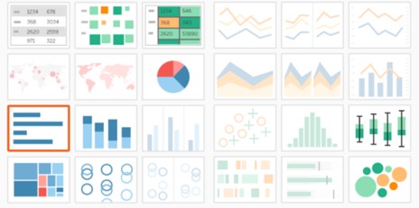
It is considered the graphical representation of data as well as a pool of information. By making use of visual elements such as graphs, charts, as well as maps, tools of data visualization deliver an easy and accessible way to not only keenly observe but also comprehend the outliers, trends, and data patterns.
A lot of discussions go around regarding which tool, among R Vs Tableau, should be considered. Below are some pointers that would greatly help one to choose the best option accordingly.
Tableau is considered to be a fantastic tool for data visualization in order to depict pattern discovery. Learning and utilizing Tableau takes very little time for performing visualization activities.
However, R possesses a steep learning curve. If anyone makes an investment in using R, he/she will get a greater reward out of it. R is considered to be more than merely a programming language; it is taken as a whole framework. One can easily cross the countless libraries such as data manipulation, visualization, machine learning (ML), google charts, financial analysis, as well as text mining, and web app analysis.
Comparison of R Vs Tableau
R is not just a dashboarding or reporting tool. Several people use it for the dashboard purpose, however, it is a full web framework. With R comes various benefits, and while comparing it with Tableau, a few considerations must be made. IN this blog, the comparison of Tableau and R will be done for the following areas:
- Connectivity
- Interactivity and User Input
- Visual styling
2.1 Connectivity
Tableau has two options regarding the data connection. Firstly, it can be connected with the local file such as Excel, CSV, PDF, JSON, Spatial, etc. Secondly, it can be connected through a remote server. On the contrary to this, R makes use of the programming language and connects to the source. For domain-specific sources, R has an upper edge over its competitor, Tableau. For example, with R, it becomes easy to load as well as analyze the gene expression CAD or data files. However, these sources can be problematic for Tableau to perform.
2.2 Visual Styling
Tableau does not provide the option of tweaking the visuals. It has been designed to look better out-of-the-box, and it is on the end-user to bring variation into the color, titles, axes, fonts, as well as other little things. The tweakable factors rely mainly on the plot type one wants to tweak; however, Tableau does not provide much control to its users regarding the visual styling as R does. When compared to other business intelligence tools like Power BI services, Tableau offers limited flexibility in customization.
R provides its end users with the visual styling option. Its end users can customize everything using this. In order to initiate this, the user will first be required to create the folder ‘www’ where the app.R is placed. Within this file, it would require creating a file named ‘main.css’. Through CSS, one can use everything while styling using the R dashboards.
To link the R app to the CSS file, add “theme = main.css” after ‘fluidPage’ within the R file. And all the steps are done.
Also Read: How Much Does Power BI Cost?
2.3 Interactivity and User Input
There are not many options to do with the “user input” in the Tableau tool. These are restricted and limited since it has not been designed for these types of things. Nevertheless, inputs are considered to be mandatory for interactive as well as well-built dashboards because they provide a way to make and interact with the app. In making interaction with the app or “interactivity,” is a parameter where R outshines Tableau. R gives its users a wide array of “input options”.
It becomes very easy to analyze the data through interactivity. For instance, components of ‘file input’ can make the one to upload a file to explore in the dashboard, which is then filtered by data and column selectors. This has been contrasted with the read-only dashboards that do not enable their users to interact with data or upload the data file.
Using the R dashboards, one can build the whole interactive form using the passwords as well as “field input abilities”. This adds an additional layer of options for the R users. Interactivity is considered to be the main parameter that separates the simple and normal UI/UX-based dashboards from the powerful as well as enterprise-level BI (business intelligence) tools.
From the above comparison points, it can be observed that the performance delivered by R is better in comparison to the Tableau data visualization tool. R possesses more options in its dashboard than its competitor, Tableau.
How Algoscale can help in improving Business Intelligence Analytics using Data Visualization Tools?
Experts at Algoscale a trusted data consulting agency can assist you in incorporating the jumble of random data into crisp visualization, thus improving your operational performance as well as assisting its clients in every manner to smooth their business performance. Using the Algoscale expertise, one might observe a significant reduction in time consumption, and a significant efficiency would be observed.
Ready to transform your complex data into clear, actionable visualizations and drive significant operational improvements? Experience real-time data analysis and unprecedented efficiency with Algoscale’s expertise. Explore how Algoscale’s Tableau Consulting Services can help you visualize your success – learn more now!