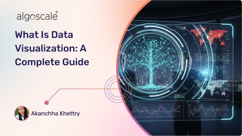
In today’s age, where almost everything can be delivered instantly, many organizations still spend hours trying to understand their own data without effective data visualization. This is much like relying on paper roadmaps when Google Maps offers intuitive, at-a-glance visuals for understanding congestion patterns and identifying alternative routes by transforming raw location and GPS data for millions.
Data visualization, often supported by expert data visualization consulting services, is the means through which complex data is communicated using intuitive graphics such as charts, infographics, and plots. These visuals help translate raw data into simplified, data-driven insights that enable faster understanding and more efficient decision-making.
This blog offers a comprehensive guide to data visualization, helps you understand why it is in high demand, industry-specific use cases, tools and techniques for data visualization, and best practices organizations should focus on to unlock strategic intelligence from their data.
What is Data Visualization?
Every business today generates a data explosion with day-to-day activities like subscriptions, card swipes, social media interactions, and clicks contributing to ever-growing digital footprints. This massive volume of data is your most valuable asset for growth because it can guide decisions, offer visibility into processes, and reveal insights and patterns that align with your strategic objectives. But raw data, in itself, cannot deliver this clarity. With data visualization, your organization’s most valuable asset remains nothing but digital clutter.
Data visualization is the means through which complex data is transformed to easy-to-understand visuals, such as charts, graphics, maps, or infographics, enabling teams to make sense of large data volumes generating at a fast pace, spot trends and patterns quickly from their activities and customer behaviour, and identify insights that guide growth decisions quickly.
Also explore: Microsoft Fabric Consulting Services for unifying data integration, engineering, analytics, and visualization and get actionable insights easily.
According to a report by Mordor Intelligence, the data visualization market is valued at USD 10.92 billion in 2025, and is projected to reach USD 18.36 billion by 2030, registering a CAGR of 10.95% during the forecast period. These statistics highlight the growing importance of data visualization across businesses of all sizes and in every industry.
Let’s understand what is driving this explosive growth and why data visualization has become a core business priority in our age.
Why Is Data Visualization In High Demand In 2025?
The proliferation of data is the by-product of digital-first business activities. A G2 report on big data statistics in 2025 found that businesses across the globe generate approximately 402.74 million terabytes of data every day. The sheer volume and scale of this data needs businesses to understand what it means for their organizations, and comprehend the story it tells about their progress backed by numbers. This is where data visualization comes into the picture, triggering high demand because of the following reasons:
1. The shift towards Real-time Decision-Making Dashboards
Businesses are transforming their pipelines to have fresh and accessible data in their warehouses instantly. Look around in any industry and you will notice that their survival and competitive edge depends on low-latency data visualization– banking requires live fraud detection, healthcare monitors patients’ vital parameters 24*7 and requires instant change updates, retail and e-commerce require real-time sales heatmaps for peak events, and manufacturing requires machine status and downtime update as it happens via factory floor dashboards.
2. Universal Accessibility and Team Alignment
Modern enterprises cannot afford team, product, or service delivery misalignment as it tends to frustrate customers, slow down progress, and create confusion across the entire organization. Data visualization tells the data story in an universally accessible format and enables teams to align on what each scenario means, making it easier for them to identify their next move based on priorities.
3. Extensive Scope
Every industry today needs the ability and means to transform their raw and unstructured data into actionable information. As such, data visualization has an extensive scope of application from finance, healthcare, manufacturing, education, retail, and so on, with each industry using it for different use cases based on their priorities.
4. Accelerating Big Data Visualization
More and more businesses are recognizing the importance of big data and data analysis investments. For the same reason, machine learning with large datasets is required for smooth data visualization in big data. ML, with its large datasets, may be difficult to process and explain. It is here that information data visualization can accelerate the process and deliver data in a simplified format for the company to understand.
Industry and Role-Specific Real-World Use Cases For Data Visualization
Having understood the growing importance of data visualization, let us now look at industry and role-specific data visualization use cases:

1. Sales Data Visualization
Sales teams can use data visualization to monitor pipeline health, campaign progress, and revenue forecasts. It helps them track disparate data from CRM systems, customer interactions, website analytics, marketing automation tools, and transaction records, get a unified view of the same, and identify high-growth opportunities to improve conversions. Sales teams can make data-driven decisions with visual charts, focussed pivot tables, and graphs as they offer granular visibility into customer behaviour, market trends, and competitor strengths.
2. Finance Data Visualization
Finance teams need to evaluate large volumes of complex data from ERP systems, trading platforms, market feeds, banking transactions, and regulatory reports. Business intelligence in banking, powered by data visualization, helps teams interpret market conditions instantly through unified analysis. It enables portfolio managers to track live performance and allows fraud analysts to identify recurring suspicious patterns through clear visual representations of anomaly spikes.
With these insights, financial institutions can mitigate risks, minimize losses, respond faster to emerging threats, and make compliance-ready decisions grounded in accurate, data-driven intelligence.
3. Healthcare Data Visualization
In the healthcare industry, data visualization plays a vital role in business intelligence in healthcare, enabling a connected care continuum for patients while helping healthcare professionals work more efficiently. By monitoring patient vitals, treatment records, and historical and real-time trends, care teams can detect warning signs earlier, manage clinical complexity proactively, and support better patient outcomes.
Beyond clinical care, data visualization strengthens business intelligence in healthcare by improving hospital operations. Administrators can track bed occupancy, optimize staffing, and allocate resources more effectively using clear, actionable insights. These data-driven decisions lead to smoother care journeys, improved operational efficiency, and stronger credibility for healthcare organizations.
4. Manufacturing Data Visualization
Manufacturers are always on the lookout for any quality issues, production bottlenecks, and machine failures to ensure seamless operations, but raw operational data complicates detecting these drawbacks before they impede functioning.
Data visualization can unify data from sensors, machines, and workflows into actionable insights, offering clear visuals to quality teams for detecting defect patterns and initiating faster resolution. From reducing operational waste, hefty machinery failure expenditure, improving output efficiency, and suggesting predictive maintenance areas, data visualization can optimize manufacturing operations for greater safety, reliability, and customer satisfaction.
5. Construction and Real Estate Data Visualization
Real estate teams and project managers can use data visualization to track timelines, manage cost overruns, and enhance site-level productivity with dashboards that offer real-time visibility into every stage of operations. By understanding resource utilization, sales, and market trends in real time, real estate teams are able to manage risks better, refine strategies for better planning, and drive smarter investment decisions across the project lifecycle.
6. Retail Data Visualization
Retail data analytics help retailers track their daily revenue, identify top-selling products, and compare regional performance on interactive charts to optimize efforts and investments accordingly. With real-time dashboards presenting unified data from all core touchpoints, including inventory, products, customer responses, and sales, managers can get insights of top sales drivers, understand why sales decline in a particular region, and implement tailored pricing, promotion, or customer engagement measures to amend the situation.
Data Visualization Use Cases Tailored To Business Needs
Data visualization consulting services offer data visualization tailored to unique business needs for the following objectives:
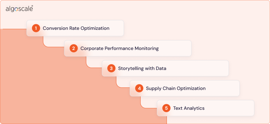
1. Conversion Rate Optimization
Data visualization enables conversion rate optimization by visualizing sales funnels, user behaviour, and marketing campaigns to identify all friction points for conversion and give teams actionable insights for maximizing the same.
2. Corporate Performance Monitoring
Data visualization helps corporate teams track operational metrics, KPIs, and strategic goals in real-time for maximizing productivity, understanding which areas need more improvement over others and how, and improving business performance with interactive dashboards that facilitate real-time collaboration with clear insights.
3. Storytelling with Data
Alignment on business goals is necessary for effort optimization from each team. Data visualization converts raw data into compelling narratives for all stakeholders to help them understand what numbers mean and enables improved decision making with clarity on the next priorities.
4. Supply Chain Optimization
Data visualization offers the required visibility into inventory, procurement data, inventory, and logistics to improve operational efficiency, reduce costs, and enhance coordination between suppliers and distribution networks.
5. Text Analytics
The amount of insights and intelligence that lay scattered across your emails, reviews, chats, and documents could be a revenue-generating engine if you can successfully unlock the same for each scenario. Text analytics services help you do exactly that by helping you analyze unstructured data from these sources, identify insights, understand sentiment, and make better decisions for customer success.
Why Is Data Visualization Important? The Benefits of Data Visualization
The American professor, Russel Ackoff, famously proposed the hierarchy of data, information, knowledge and wisdom, concluding that raw data has very little inherent value unless it is processed or contextualized. Data visualization is an enabler for the same. Discussed below are reasons why it is important:
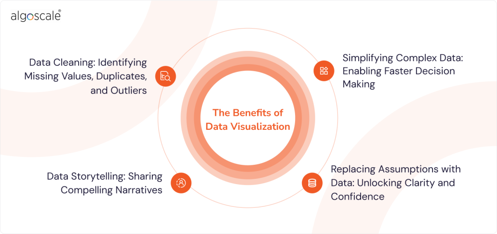
1. Data Cleaning: Identifying Missing Values, Duplicates, and Outliers
Raw datasets may not reveal inconsistencies, missing values, or outliers that visual charts or graphs make easier to spot. Data visualization facilitates seamless data cleaning by simplifying error identification, enabling prompt rectification, and effectively showing before and after changes to validate the accuracy of the cleaning process. Clean data forms the basis for data management, integration, and analytics services.
2. Simplifying Complex Data: Enabling Faster Decision Making
Business-critical insights are often buried in raw and complex data. As a result, organizations may miss meaningful customer patterns, market trends, and early signals that shape competitive advantage. This growing data complexity slows decision-making by creating distance between teams and the insights that matter most, leading to interpretation gaps and missed market opportunities. To address this challenge, data visualization consulting companies are increasingly in demand, helping organizations translate complex datasets into clear, actionable insights that support enterprise business intelligence initiatives and smarter decision-making.
3. Replacing Assumptions with Data: Unlocking Clarity and Confidence
Today’s fast-paced and rapidly evolving markets have no space for assumptions or slow progress. Businesses need to learn fast, validate their hypotheses, and iterate flexibly to keep pace with market and consumer dynamics.
This becomes possible with data visualization as it enables the transition from assumption-based to data-driven decisions by identifying patterns, anomalies, and trends in customer behaviour that assumptions often miss out. This enables organizations to move with clarity, confidence, and evidence-based insights (as opposed to guesswork) aligning with real-time scenarios.
4. Data Storytelling: Sharing Compelling Narratives
As leaders, if you were telling a traditional story to your investors, teams, or clients, you’d need interesting characters and plot twists for them to take home something. Today, data visualization has replaced them in a story told with data in any business context. Audiences find it difficult to make sense of convoluted data, miss valuable insights, and grasp the criticality of the issue being discussed. Data visualization helps you communicate a compelling narrative, establish important information, and align on key priorities.
Data Visualization Methods and Types For Effective Comprehension
The end goal of data visualization is to help teams identify and understand meaningful patterns for effective decision making. Depending on the level of insights required for different purposes, different data visualization methods are deployed. Some of the most common ones are described as follows:
- Tables: Data is displayed in rows and columns.
- Charts: Tabular or graphical form of information representation with data along both axes.
- Graphs: Data is presented usually at a right angle along two axes with diagrams of lines, segments, or curves representing comparisons of variables.
- Geospatial: A visualization that uses a map form to show data with shapes and colours to identify relationships between different data pieces and locations.
- Infographic: Typically uses charts and diagrams to represent data with a combination of words and visuals.
- Dashboards: A unified display of visualizations from different aspects of business to guide decision making from a single source of truth.
Specific Examples of Data Visualization
- Bar Chart: Compares numerical values.
- Area Map: This is a form of geospatial visualization showing specific values set over any geographic location.
- Gantt Chart: Bar chart depictions of tasks and timelines, typically used by project managers.
- Heat Map: A map form geospatial visualization that uses different colours to display specific data, considered great for behavioural data visualization by location.
- Pie Chart: Data is shown as a percentage of the whole with a circular chart and triangular segments.
- Tree Maps: Hierarchical data represented through nested shapes, mostly rectangles.
Data Visualization Tools and Techniques
With the growing demand for data visualization, different tools are making their way to the business ecosystem depending on users and their unique needs. Some of the most popularly used data visualization tools are listed below:
1. Tableau
Tableau appeals to all users with its user-friendly interface, extensive interactive visualization library and integration with commonly used data management solutions like DataBricks, Google Big Query, Hadoop, and Amazon Web Services. Tableau consulting services also help you extend its capabilities to professional analytics, enabling users to seamlessly manage any type of data, and integrate visualizations into intuitive and functional dashboards.
2. FusionCharts
FusionCharts is mostly used by coders to add visual data analytics techniques to data-driven applications, offering diverse integration capabilities with frontend and backend frameworks like Vue, React, Angular, and PHP. The tool is known for supporting diverse data visualization needs and offers pre-built themes, extensive customization, ready-to-use charts, and documentation streamlining developers’ efforts. The best data analytics consulting firms help you use FusionCharts to your advantage by unlocking and aligning its capabilities to your goals to maximize data visualization ROI.
3. Power BI
Power BI is one of the most commonly used tools for complex data visualization and offers an intuitive drag-and-drop interface with powerful MailChimp and Salesforce integrations. With its robust capabilities, Power BI is known to handle any amount and type of data, enabling users to create customized reports from multiple sources and quickly get meaningful insights.
Explore Power BI Consulting Services to unlock the complete potential of Power BI for smart data insights.
4. Sigma Computing
Sigma data visualization offers dashboards and other cutting-edge capabilities optimized for speed and real-time interaction, making it a strong fit for modern business intelligence services. It supports geospatial maps, standard charts, and advanced visuals such as Sankey diagrams for deeper flow analysis. A key strength is its ability to connect directly with your cloud data warehouse and run live queries at the source, ensuring accurate, up-to-date insights for decision-makers.
Based on your audience, data type, and business context, selecting the right data visualization approach is essential to getting real value from business intelligence services. The right techniques improve decision-making, collaboration, and operational efficiency. Commonly used data visualization techniques include:
- Charts: Charts are widely used and preferred for showing the development of multiple datasets for their simplicity.
- Plots: Used for distributing two or more datasets over 2D or 3D spaces, displaying their relationship and parameters. For big data, more complex plots are used to visualize large data volume relationships.
- Diagrams: These can be tree-like, hierarchical, or multi-dimensional, and are used for complex relationships and links of different data types in one visual representation.
- Matrix: This is beneficial for determining the correlation between multiple and constantly updating datasets.
Data Visualization Best Practices: The Need For An Expert Data Visualization Consultant
Data visualization, or the capability of extracting actionable insights from raw data, is a strategic edge for businesses in today’s data-driven world that will help them remain agile, adapt, and stay ahead of the competition. As such, the best data visualization companies have thorough knowledge of the do’s and dont’s of data visualization to help businesses stay ahead of the curve and make optimal use of their data:
1. Knowing Your Audience
For effective data visualization, it is important to understand the needs of your audience (the specific roles you are preparing the visualization for), their challenges, and the kind of decisions they need to make with insights from this data. A one-size-fits-all approach will not work well in this regard simply because different teams understand one situation differently, based on their priorities. The frequency at which the visualization will be used by the audience is also a key determinant of the visualization.
2. Choosing The Right Visualization
Selecting the right visual is important for effectively conveying information through the data. A line chart may be helpful for working with large values with different time intervals, column charts may help compare categories with sub categories, pie charts may help for displaying specific proportions, and so on.
3. Decluttering Data
The main purpose of data visualization is clarity. Cluttered data can confuse users and fail to identify insights. Expert data visualization consultants keep the core message as clear as possible by avoiding unnecessary elements, removing excess labels, align colour usage to a cohesive pattern, and use concise labels for clear understanding.
4. Colour Codes
The use of colour must be made to convey clearer insights, group related items, and ensure accessibility of information. Some best practices to use colour schemes effectively include assigning set colours to different categories, using labels to help target users access this information, and highlighting key data with a standard colour for ease of use.
5. Simplified Dashboards
Dashboards should offer an intuitive and unified view of an organization’s data from multiple sources in a coherent manner. It is the main touchpoint through which users and decision makers assess information and drive strategic initiatives forward. This requires clarity, visual cleanliness, and ease of use to cater to the needs of users, who shouldn’t lose time on figuring out how to use it.
6. Data Storytelling
Effective data visualization guides decision makers through a story that converts raw data into actionable insights. Experts emphasize on using titles, highlighting key sections, annotations, and context enhancers tailored to the needs of the target audience for greater decision making clarity.
Conclusion
Good data visualization is the foundation for business intelligence as it converts raw data into actionable insights and positions the organization for adapting to the ever-evolving needs of the market. It facilitates better comprehension, reduces the gap between numerical values and strategic understanding, enables teams to find hidden patterns in numbers effectively, and guides decision making by replacing assumptions with data.
As the leading company for data visualization and business intelligence consulting services, Algoscale has a proven track record of delivering intuitive and easy-to-use data visualizations tailored to specific use cases and decision makers across industries. From following data visualization best practices to offering technical expertise spanning an extensive range of data visualization tools, Algoscale excels in unlocking strategic intelligence from digital footprints set by each organization. Get in touch with us today to bridge the gap between your data and organizational understanding, and transform the decisions you make at scale.
FAQs
1. Can all businesses use data visualization?
Yes, all businesses, including startups and enterprises, can benefit from data visualization. Across every industry and teams of every size, the conversion of raw data into meaningful information, clarity on the next strategic priorities, and enhanced collaboration, are key enablers of progress and adaptability in a fast-changing data-driven world.
2. What are the challenges and limitations of data visualization?
Key challenges of data visualization include the possibility of human error via human inputs for visualization, oversimplification of data, and focusing too much on aesthetics rather than telling a compelling story to drive decision-making through visualization. These can be avoided by deploying technologies like AI and ML to vet inputs and avoid the misinterpretation of ideas, leveraging data analytics consulting services to avoid oversimplification and working with data that matters without obscuring it, and relying on proven expertise for data visualization to work as a strategic tool for the organization.
3. What is an example of data visualization?
Spotify Wrapped is a popular example of data visualization, enabling the music streaming company to use data visualization to reward existing users for their time investment in the app, drive brand value with extensive social media shares, and invite music lovers worldwide to choose Spotify as their music companion.
4. What are Power BI license types?
Power BI license types can be categorised on the basis of per-user and capacity-based licenses.
Per-user licenses include:
- Power BI Free for individuals learning or building reports (but with limited sharing)
- Power BI Pro for team sharing, collaboration in workspaces, and allowing up to 8 refreshes per day.
- Power BI Premium Per User for large, 100 GB models, paginated reports, and up to 48 refreshes per day.
Capacity-based licenses include:
- Power BI Premium for org-wide sharing and dedicated compute for large organizations.
- Power BI Embedded for developers embedding reports into custom apps for external users.