


Key Takeaways
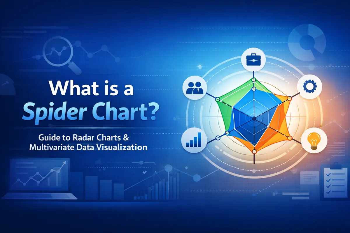
- A spider chart (also called a radar chart, web chart, or Kiviat diagram) displays multiple variables on axes radiating from a single center point, forming a polygon that makes multivariate comparison instantly visual.
- It excels at comparing performance profiles, skill assessments, product feature comparisons, and machine learning model evaluation across 5–8 variables.
- Known limitations include area distortion, axis-order dependency, and overplotting — making it the wrong tool for certain datasets.
- You can build one in Python (matplotlib or Plotly), Excel, Tableau, Power BI, and Google Sheets.
Imagine you are comparing three job candidates. Each has been rated across eight competencies: communication, technical skill, leadership, creativity, reliability, problem-solving, teamwork, and adaptability. You could build a bar chart for each person — eight bars, three charts, twenty-four individual bars your hiring panel must mentally compare. Or you could put all three profiles on a single spider chart and read the result in seconds.
This is exactly what spider charts are designed for. Rather than asking readers to mentally stitch together columns of data, they collapse multivariate data into a single polygon whose shape tells the whole story at a glance.
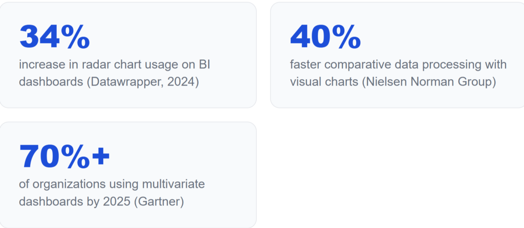
The demand for this kind of data visualization technique is growing fast. According to a 2024 Datawrapper analysis of over 500,000 published charts, radar-style charts have seen a 34% increase in usage across business intelligence dashboards over the past three years, driven largely by the rise of performance benchmarking and employee skill assessment frameworks. Research by the Nielsen Norman Group consistently shows that decision-makers process comparative data 40% faster when presented visually rather than in tabular form. And according to Gartner, by 2025 over 70% of organizations were using at least one form of multivariate data analysis dashboard as part of their regular reporting stack.
Whether you work in data science, business analytics, sports analytics, or quality management, understanding when and how to use a spider chart — and when to reach for something else — is a core skill for any practitioner who works with quantitative variables. This guide covers everything: the precise spider chart definition, key components, types, real-world examples, honest limitations, chart comparisons, and step-by-step code.
What is a Spider Chart?
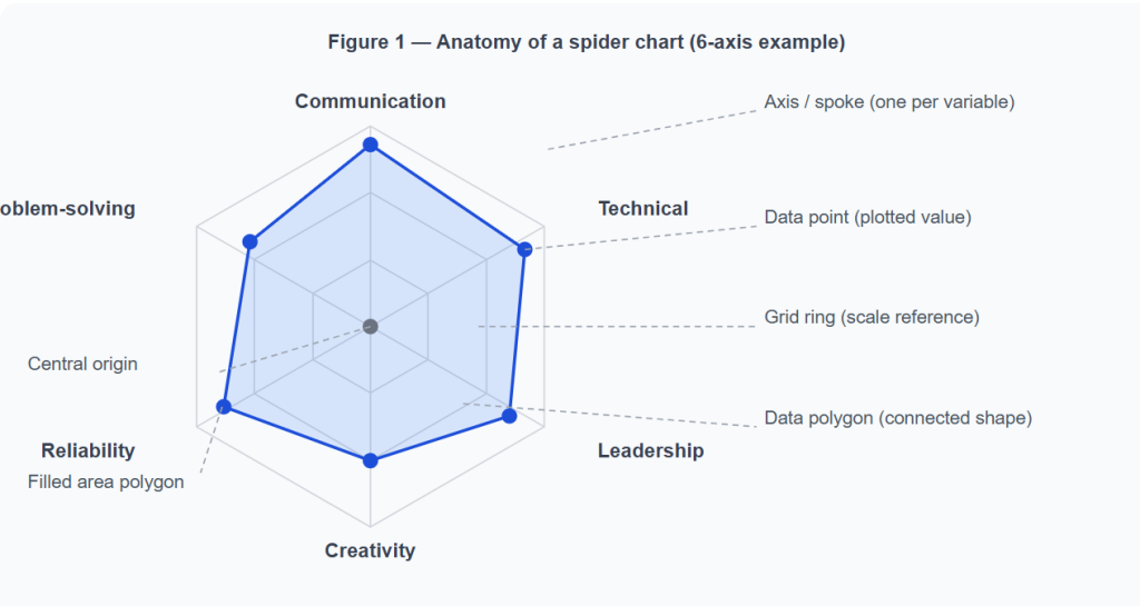
A spider chart is a two-dimensional graphical method for displaying multivariate data, where three or more quantitative variables are each represented on their own axis, all radiating outward from a shared central point. Data values are plotted along each axis and connected to form a polygon. The shape, size, and symmetry of that polygon communicate the overall profile of whatever you are measuring.
It goes by many names. Radar chart, web chart, star chart, cobweb chart, polar chart, and Kiviat diagram are all used interchangeably in practice. The visual similarity to a spider’s web is what gives the most popular name its staying power. The chart is also occasionally called a star plot or spider web chart in academic literature.
Spider chart vs. radar chart — are they actually different?
This is one of the most frequently searched questions on the topic, and the short answer is: no. The terms are synonymous. “Spider chart” refers to the web-like visual appearance; “radar chart” refers to the circular, multi-axis coordinate system resembling an aviation radar screen. Whether a tool labels it a spider chart or a radar chart, you are looking at the same data visualization technique. Some practitioners use “filled radar chart” to describe versions where the polygon area is shaded, but even that distinction is stylistic rather than structural.
A brief history
The spider chart history is older than most people realize. Georg von Mayr, a German statistician, introduced star plots using polar coordinate diagrams in 1877 to represent multivariate data visually — making him the person who invented the spider chart in its earliest form. The format gained broader recognition in the mid-20th century and entered mainstream business and data science use alongside the rise of digital dashboard tools in the 1990s and 2000s.
Must Read: What is Pie Chart?
Key Components of a Spider Chart
Understanding what each element does is essential before you can read — or design — a spider chart effectively. Every well-built radar chart diagram consists of the same five structural elements.
- Central origin — The point at the very center of the chart where all axes meet. It typically represents zero or the minimum value for every variable.
- Axes / spokes (radii) — Each axis represents one variable. In a standard spider chart, axes are evenly spaced: a six-variable chart has axes at 60° intervals; a five-variable chart at 72°. These are the equiangular spokes that give the chart its web-like structure.
- Grid rings — The concentric polygons running perpendicular to the axes. They serve the same function as horizontal gridlines in a bar chart: a scale reference that lets readers estimate values without tracing each point back to the axis tick.
- Data polygon — The shape formed by connecting each plotted data point. Its overall size indicates magnitude; its shape reveals the pattern of relative strengths and weaknesses across variables.
- Legend — Required when overlaying two or more data series on the same chart to distinguish which polygon belongs to which entity.
How polar coordinates work — intuitively
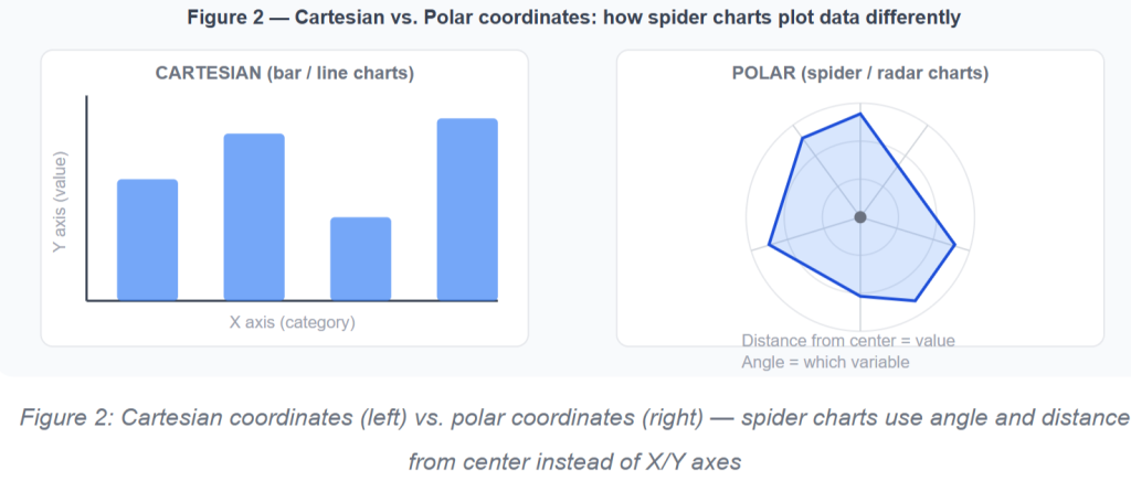
Most charts use Cartesian coordinates — an X axis and a Y axis at right angles. A spider chart uses polar coordinates instead. Every data point is defined by two values: its distance from the center (the value on that variable’s scale) and its angle from a reference axis (which determines which variable it belongs to). This is why data normalization is critical: if one axis runs from 0 to 100 and another from 0 to 1,000,000, the polygon shape becomes meaningless. All axes must share the same scale, or each must be independently normalized to a consistent range before plotting.
Types of Spider Charts
Not all spider charts look the same, and choosing the right variant affects how clearly your data communicates. There are four main types of radar charts used in practice.
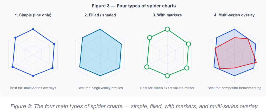
1. The simple radar chart connects data points with lines but leaves the interior empty, working best when comparing multiple entities simultaneously.
2. The filled radar chart shades the enclosed area with a semi-transparent color, making it ideal for communicating a single entity’s overall “footprint.”
3. The spider chart with markers places visible data point indicators on each axis, helping audiences read precise values.
4. The multi-series radar chart overlays two or more polygons for direct competitive analysis — but requires careful transparency settings to stay legible beyond three series.
Real-World Use Cases with Worked Examples
1. Employee performance evaluation
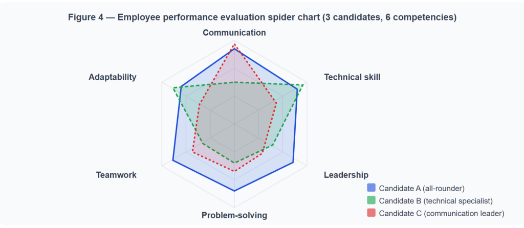
The most common business application for spider charts is employee performance evaluation. Consider a quarterly review where three candidates are assessed across six competencies: communication, technical knowledge, leadership, problem-solving, teamwork, and adaptability — each scored from 1 to 10. Plotting each candidate on the same radar chart for skill assessment produces a unique polygon “fingerprint.” A strong all-rounder shows a large, roughly symmetrical polygon. A technical specialist — high technical score but lower on communication and leadership — shows a polygon that bulges in one direction while staying near the center elsewhere. his makes coaching priorities unmistakably clear. Many organizations rely on BI consulting services to standardize how performance metrics are visualized across teams.
2. Sports analytics
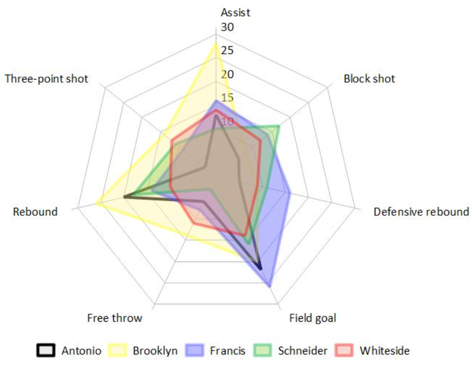
Spider charts for sports analytics have been widely adopted since the early 2000s. A basketball player might be profiled across points per game, rebounds, assists, steals, blocks, and three-point percentage. Overlaying a radar chart player comparison against the league average creates an instant visual summary of where the athlete dominates and where improvement is needed. UEFA, NBA, and cricket analytics teams all use this format in scouting reports because the chart compresses six to ten statistics into a single scannable shape that both coaches and executives can interpret without data expertise.
3. Product and competitor analysis
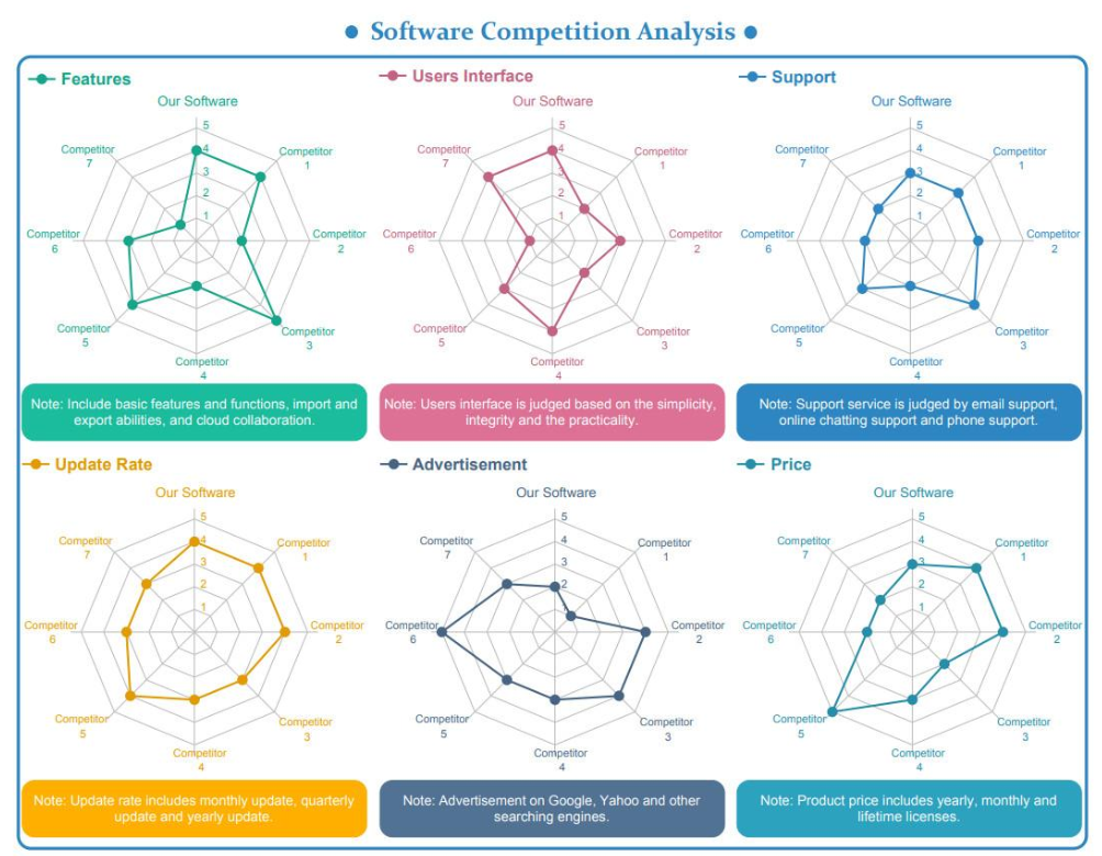
Marketing and product teams use spider charts for competitor analysis to compare products or services across multiple dimensions. A software company evaluating three competing project management tools might score each across ease of use, integration depth, reporting capabilities, mobile experience, pricing value, and customer support. The resulting radar chart examples in business make trade-offs immediately visible — which product leads overall, which excels in any given category — in a way that feature comparison tables obscure.
4. Machine learning model evaluation

This is a use case most guides overlook entirely, yet it is one of the most natural fits for a data science audience. When comparing classifier models across performance metrics visualization — precision, recall, F1-score, AUC-ROC, and inference speed — a spider chart for machine learning model evaluation makes trade-offs between models instantly legible. A model with high AUC-ROC but poor recall shows a polygon that balloons in one area and collapses in another. For presentations to both technical and non-technical stakeholders, this visual summary bridges the gap between raw metric tables and business-relevant insight. The radar chart for precision recall F1 score comparison is now a standard visualization in model selection workflows.
5. Six Sigma and quality control

In process improvement and quality management frameworks like Six Sigma, spider charts are used to visualize quality dimensions across manufacturing or service processes. A retail chain might track food quality, service speed, cleanliness, value for money, consistency, and staff performance across multiple locations. Overlaying each location’s polygon against the brand standard creates a gap analysis visualization that makes underperforming dimensions immediately actionable — the precise input a continuous improvement team needs to prioritize corrective interventions.
6. Marketing campaign performance
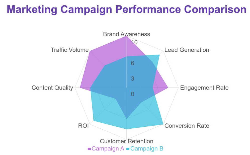
Performance marketers use radar charts for marketing KPIs to compare campaigns across channel-specific metrics: click-through rate, cost per acquisition, engagement rate, conversion rate, brand recall lift, and reach — all on a single normalized chart. Rather than switching between six individual dashboards, a marketing director reads one view showing which campaign had the best overall profile and where each one underperformed on specific dimensions. These insights are often integrated into broader reporting using BI dashboards examples for better decision-making.
Turn Data into Clear, Actionable Insights
Spider charts are just one part of effective data storytelling. If you’re looking to build dashboards that actually drive decisions, our team offers expert support through data visualization consulting services, BI consulting services, and Power BI consulting services tailored to your business needs.
Get a Free Consultation
Advantages, Limitations & Common Mistakes
What spider charts do well
Spider charts are uniquely efficient for one specific job: displaying the performance profile of one or a small number of entities across multiple variables simultaneously. No other common data visualization technique does this in as compact a space. They make it easy to spot outliers — a single variable with a dramatically high or low value jumps out visually because the polygon bulges or collapses in that direction. They are particularly valuable for gap analysis visualization, because overlaying a current-state polygon against a target-state polygon makes the distance to close across each dimension immediately readable.
Where spider charts fail
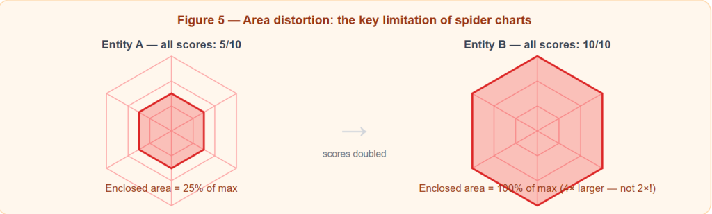
The most structurally significant radar chart limitation is area distortion. Unlike a bar chart where doubling a value doubles the bar length, doubling values in a spider chart more than doubles the enclosed area — because area scales with the square of the linear distance. Readers who focus on the polygon’s overall size will systematically overestimate differences between entities.
A second problem is axis-order dependency. The shape of the polygon changes significantly depending on the sequence in which variables are placed around the circle. Two charts showing identical data but with axes in different orders will look completely different — meaning conclusions drawn from the “shape” of a polygon are partly artifacts of a design choice, not the underlying data.
Third, overplotting on radar charts becomes a serious readability problem beyond three or four overlaid data series. The polygons bleed into each other, and readers must work hard to untangle which shape belongs to which entity.
Common mistakes to avoid: Using a spider chart for time-series data (use a line chart instead), using more than 10 axes (labels crowd the perimeter), using inconsistent scales across axes (produces a meaningless polygon shape), and overlaying more than 4 series (use small multiples instead).
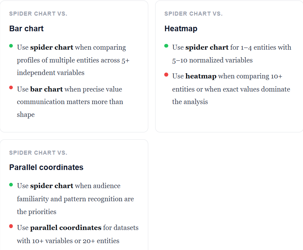
Best practice tip: The ideal range for a spider chart is 5–8 variables, all normalized to the same scale. In more complex scenarios, teams often work with data consulting services to choose the most effective visualization strategy. If you have fewer than 3 variables, use a bar chart. If you have more than 10, consider a heatmap or parallel coordinates plot.
Spider Chart vs. Other Chart Types — Decision Guide
Choosing the right data visualization technique is as important as building it correctly. Below is a clear-headed comparison of when a spider chart is the right tool and when to reach for an alternative.
| Scenario | Best chart | Why |
|---|---|---|
| 5–10 independent variables, 1–4 entities | Spider chart | Pattern recognition across multiple dimensions is the goal |
| Precise value comparison across categories | Bar chart | Exact magnitudes are clearer on a linear axis |
| Trend over time (sequential data) | Line chart | Spider chart axes imply independence, not sequence |
| 10+ variables or 10+ entities to compare | Heatmap | Scales far better; spider chart becomes unreadable |
| Spot correlations across many variables | Parallel coordinates | Better suited to large-scale multivariate correlation analysis |
| Comparing profiles against a target/benchmark | Spider chart | Gap analysis between two overlaid polygons is visually immediate |
| ML model evaluation across 5–6 metrics | Spider chart | Trade-offs between models visible at a glance |
How to Create a Spider Chart
Python — matplotlib
Matplotlib does not have a built-in spider chart function, but you can construct one using its polar axes system. The example below compares three machine learning models across five evaluation metrics — demonstrating the radar chart for precision recall F1 score use case described earlier.
import numpy as np
import matplotlib.pyplot as plt

# Define the variable labels (axes)
categories = ['Precision', 'Recall', 'F1-Score', 'AUC-ROC', 'Inference Speed']
N = len(categories)

# Values for each model (normalized 0–1)
random_forest  = [0.82, 0.78, 0.80, 0.88, 0.70]
gradient_boost = [0.86, 0.80, 0.83, 0.91, 0.55]
neural_network = [0.88, 0.85, 0.86, 0.93, 0.45]

# Compute evenly-spaced angles for each axis
angles = np.linspace(0, 2 * np.pi, N, endpoint=False).tolist()

# Close the polygon by repeating the first value
def close(values):
    return values + [values[0]]

angles_closed = angles + [angles[0]]

fig, ax = plt.subplots(figsize=(7, 7), subplot_kw=dict(polar=True))

ax.plot(angles_closed, close(random_forest),  'o-', lw=1.5, label='Random Forest',  color='#185FA5')
ax.fill(angles_closed, close(random_forest),  alpha=0.10, color='#185FA5')

ax.plot(angles_closed, close(gradient_boost), 'o-', lw=1.5, label='Gradient Boost', color='#0F6E56')
ax.fill(angles_closed, close(gradient_boost), alpha=0.10, color='#0F6E56')

ax.plot(angles_closed, close(neural_network), 'o-', lw=1.5, label='Neural Network', color='#993C1D')
ax.fill(angles_closed, close(neural_network), alpha=0.10, color='#993C1D')

ax.set_xticks(angles)
ax.set_xticklabels(categories, size=11)
ax.set_ylim(0, 1)
ax.set_yticks([0.2, 0.4, 0.6, 0.8, 1.0])
ax.legend(loc='upper right', bbox_to_anchor=(1.3, 1.1))
ax.set_title('ML Model Comparison — Radar Chart', size=13, pad=20)

plt.tight_layout()
plt.savefig('spider_chart_models.png', dpi=150, bbox_inches='tight')
plt.show()
Key technique: The polygon must be “closed” by appending the first value to both the data list and the angles list. Without this step, the polygon is left open and renders as an incomplete fan shape rather than a continuous web.
Python — Plotly (interactive radar chart)
If you need an interactive radar chart in Python — one that tooltips on hover, highlights on legend click, and embeds cleanly in a web dashboard — Plotly’s Scatterpolar is the right tool. It also handles polygon closing automatically, keeping the code cleaner.
import plotly.graph_objects as go

categories = ['Precision', 'Recall', 'F1-Score', 'AUC-ROC', 'Inference Speed']

fig = go.Figure()

models = {
    'Random Forest':  [0.82, 0.78, 0.80, 0.88, 0.70],
    'Gradient Boost': [0.86, 0.80, 0.83, 0.91, 0.55],
    'Neural Network': [0.88, 0.85, 0.86, 0.93, 0.45],
}

colors = ['#185FA5', '#0F6E56', '#993C1D']

for (name, values), color in zip(models.items(), colors):
    fig.add_trace(go.Scatterpolar(
        r=values + [values[0]],       # close the polygon
        theta=categories + [categories[0]],
        fill='toself',
        fillcolor=color,
        opacity=0.15,
        line=dict(color=color, width=2),
        name=name
    ))

fig.update_layout(
    polar=dict(radialaxis=dict(visible=True, range=[0, 1])),
    showlegend=True,
    title='ML Model Comparison — Interactive Spider Chart',
)

fig.show()
Excel — step by step
Building a spider chart in Excel takes under two minutes once your data is formatted correctly. This is the most accessible approach for non-technical teams and produces a fully editable chart that integrates with any Excel-based reporting workflow. For enterprise use cases, teams often collaborate with Power BI consulting services to build more advanced and interactive dashboard environments.
- Enter your data in a table: first column = variable names (e.g., Communication, Technical, Leadership); subsequent columns = entity values. Include column headers.
- Select the entire table including headers.
- Go to Insert → Charts → Other Charts → Radar.
- Choose your type: plain Radar (line only), Radar with Markers, or Filled Radar. Click OK.
- Right-click the chart → Format Data Series to adjust line weight, fill opacity, and marker style. For best readability, set fill opacity to 40–50% and limit overlaid series to three.
Excel tip for radar chart templates: Save your formatted chart as an Excel template (.crtx) via right-click → Save as Template. This lets you apply the same visual style to future spider charts with one click.
No-code tools for spider chart creation
If you need a free spider chart maker online without writing code, several tools offer this capability. For larger-scale implementations, data visualization consulting services can help design consistent and scalable dashboard solutions. Flourish (flourish.studio) provides browser-based interactive radar charts with no sign-up required. Google Sheets supports spider charts in Google Sheets natively through Insert → Chart → Chart type → Radar chart. Tableau and Power BI both include radar chart support in their built-in visualization libraries (Power BI requires a custom visual from the AppSource marketplace for advanced configurations). Canva offers a drag-and-drop radar chart template suited for design-focused presentations and reports.
Turn Data into Clear, Actionable Insights
Spider charts are just one part of effective data storytelling. If you’re looking to build dashboards that actually drive decisions, our team offers expert support through data visualization consulting services, BI consulting services, and Power BI consulting services tailored to your business needs.
Get a Free Consultation
Conclusion
Spider charts are one of those data visualization techniques that reward careful use. When you have the right data — a handful of independent quantitative variables, a small number of entities to compare, and an audience that benefits from seeing the full performance profile rather than isolated metrics — there is no better tool for making multivariate data patterns visible at a glance.
The key is knowing the boundaries. Radar charts are not the right tool for time-series data, large datasets, or situations where precise value communication matters more than shape recognition. Used within those boundaries — employee performance evaluation, sports analytics, machine learning model evaluation, product feature comparison, quality control gap analysis, and marketing KPI dashboards — spider charts remain one of the most information-dense and intuitively readable chart types available.
The next time you find yourself staring at a table of six or more numbers per entity and wishing you could see the pattern, there is a good chance a spider chart is the answer.
Frequently Asked Questions
1. What is a spider chart used for?
A spider chart is used to compare multiple entities — people, products, models, or processes — across several independent quantitative variables simultaneously. It is most valuable when the shape of the data profile matters as much as individual values: spotting which entity is most well-rounded, which is a specialist, and where specific performance gaps exist.
2. What is the difference between a spider chart and a radar chart?
There is no functional difference. “Spider chart” and “radar chart” describe the same visualization. The spider name comes from the web-like appearance of the connected polygon; the radar name comes from the circular, multi-axis structure resembling an aviation radar display. Both terms refer to the same data visualization technique. Other common aliases include web chart, star chart, cobweb chart, and Kiviat diagram.
3. How do you read a spider chart?
Each axis / spoke represents one variable. The farther a data point sits from the center, the higher its value on that variable. Connect all the data points for one entity and you get a polygon. A large polygon covering most of the chart area indicates strong overall performance benchmarking. A lopsided polygon that bulges in one direction indicates a specialist profile. Overlapping polygons for two entities make it easy to see where each one outperforms the other on each individual dimension.
4. What are the disadvantages of a spider chart?
The main radar chart limitations are: (1) area distortion — the enclosed area scales quadratically, not linearly, so visual size overstates performance differences; (2) axis-order dependency — changing the variable sequence changes the polygon shape without changing any data; (3) difficulty comparing exact values across axes; and (4) visual clutter when more than three or four series are overlaid. For precise value comparison or large datasets, bar charts, heatmaps, or parallel coordinates plots are more appropriate.
5. How many variables can a spider chart have?
The practical minimum is three variables. Below three, a bar chart communicates the same information more clearly. The practical maximum for readability is around eight to ten variables. Beyond ten, axis labels crowd the perimeter and polygon shapes become too similar to distinguish meaningfully. For five to eight well-normalized quantitative variables, spider charts perform at their best.
6. How do I make a spider chart in Python?
Use matplotlib with polar axes and manually close the polygon by appending the first value to both the data list and the angles array — as shown in the full spider chart matplotlib code example above. For interactive radar charts in Python, use Plotly’s go.Scatterpolar with fill='toself'. It handles polygon closing automatically and produces a hover-enabled, dashboard-ready chart.