

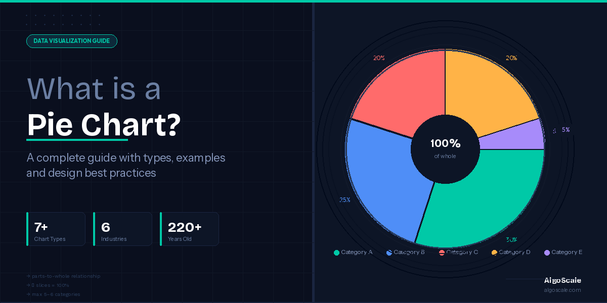

Every day, billions of decisions — from corporate boardroom strategy to a school student’s science project — are shaped by data. But raw numbers sitting in a spreadsheet rarely tell the story on their own. They need to be visualized. And for over two centuries, one chart has remained one of the most universally recognized tools for doing exactly that: the pie chart.
Despite being one of the oldest and most debated forms of data visualization, the pie chart endures for a reason. According to a report by Visme, pie charts are among the three most commonly used chart types in business presentations globally. A survey by Statista found that approximately 84% of professionals regularly use charts and graphs to communicate data insights at work — and circular charts like pie charts consistently rank in the top formats chosen for proportional data. Meanwhile, research from MIT’s Sloan School of Management confirms that visual data representations improve decision-making speed by up to 28% compared to text-heavy reports.
So what exactly is a pie chart? When should you use one — and when should you avoid it? What are the different types of pie charts, and how do you build one correctly?
This complete guide answers all of it. Whether you are a business analyst, a student, a marketer, or simply someone who wants to understand how pie charts work, you’ll find clear explanations, real-world examples, design best practices, and practical creation steps — all in one place.
Quick answer: A pie chart is a circular statistical graph divided into slices, where each slice represents a category’s proportional contribution to a whole. The full circle always equals 100%.
In this guide, you’ll learn:
- What a pie chart is and how it works
- The complete anatomy of a pie chart
- All major types of pie charts (with visuals)
- When to use — and when to avoid — a pie chart
- Real-world examples across industries
- How to read, make, and design an effective pie chart
- How it compares to bar charts, donut charts, and other alternatives
Let’s start from the very beginning.
What is a Pie Chart? — Full Definition & Key Components
A pie chart is a circular statistical graphic in which a circle is divided into slices to illustrate the numerical proportions of a dataset. Each slice — also called a sector — corresponds to a single category, and its size (both in area and arc length) is directly proportional to the value it represents relative to the whole.
In simpler terms: the pie represents 100% of something, and every slice shows you how much of that “something” belongs to each category.
Pie charts are also commonly referred to by other names depending on the context — circle chart, sector chart, or circle graph — but they all describe the same fundamental visualization structure.
The defining rule of a pie chart is simple: all slices must add up to exactly 100%, representing the complete whole. This is what sets it apart from nearly every other chart type — it is not designed for trends, comparisons between groups, or time-based data. Its sole purpose is to show part-to-whole relationships.
The anatomy of a pie chart
Understanding the individual components of a pie chart helps you both read and design them more effectively. Below is a breakdown of every element you’ll find in a well-constructed pie chart.
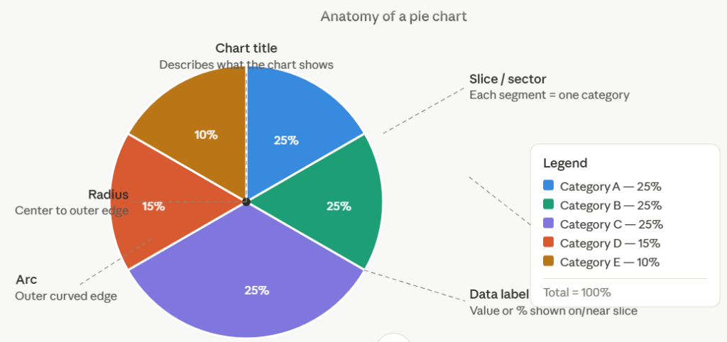
Here is what each component of a pie chart means:
Slice / Sector — The individual wedge-shaped segment that represents a single category. The size of the slice is proportional to its share of the total.
Arc — The curved outer edge of each slice. The arc length is proportional to the slice’s value — a larger share means a longer arc.
Radius — The straight line from the center of the circle to the outer edge. All slices share the same radius, which defines the circle’s overall size.
Center point — The common origin from which all slices radiate. In a donut chart (a pie chart variant), this center is hollow and can display a summary metric.
Data label — The text placed on or near each slice that identifies the category name and its corresponding value or percentage.
Percentage annotation — The numerical figure displayed inside or alongside a slice, telling you that category’s exact proportion of the whole. Without annotations, accurately reading a pie chart is surprisingly difficult for the human eye.
Legend — A key placed outside the pie that maps each color to its corresponding category. Well-designed pie charts minimize reliance on the legend by labeling slices directly.
Chart title — A brief, descriptive heading that tells the reader what the whole circle represents (e.g., “Revenue by Product Line, Q1 2025”).
The math behind a pie chart
Every pie chart follows two straightforward formulas:
To find the percentage each category represents:
(Category value ÷ Total value) × 100 = Percentage
To find the degree angle for drawing each slice:
(Category value ÷ Total value) × 360 = Degrees
For example, if your total sales are $200,000 and one product accounts for $50,000, its slice covers 25% of the pie and spans 90 degrees (one-quarter of the full 360°).
This mathematical precision is what makes the pie chart formula so reliable — and also why forcing data that doesn’t sum to 100% into a pie chart is one of the most common visualization mistakes.
A Brief History of the Pie Chart
The pie chart is older than most people realize. Its origins trace back to 1801, when Scottish political economist and engineer William Playfair introduced it in his work The Statistical Breviary. Playfair, who also invented the bar chart and line graph, used the circular format to illustrate the proportional land areas and populations of European nations — making the pie chart one of the earliest formal tools in statistical data visualization.
However, the chart type truly captured public imagination a few decades later when Florence Nightingale adapted the concept for her groundbreaking work during the Crimean War in 1858. Her “polar area diagram” — also known as a rose chart or coxcomb chart — was a more sophisticated variant where each segment had the same angle but varied in radius to reflect values. Nightingale used it to show that far more soldiers were dying from preventable diseases than from battle wounds, ultimately influencing military medical reform. It remains one of the most powerful examples of data storytelling in history.
Through the 19th and 20th centuries, pie charts became a staple of business reports, government publications, and academic research. With the rise of spreadsheet software in the 1980s and 1990s — particularly Microsoft Excel — the circle chart became accessible to anyone with a computer, cementing its place as the go-to tool for displaying proportional data.
Today, pie charts appear everywhere: in business intelligence dashboards, news infographics, political coverage, and educational textbooks. Modern tools like Tableau, Power BI, and Google Sheets have made creating sophisticated, interactive pie charts faster than ever — though the core concept William Playfair sketched over 220 years ago remains unchanged.
Types of Pie Charts — A Visual Breakdown of All Major Variants
Not all pie charts are created equal. Depending on your data, your audience, and the story you want to tell, different types of pie charts serve different purposes. Here is a comprehensive look at every major variant you’ll encounter — along with when each one is (and isn’t) the right choice.
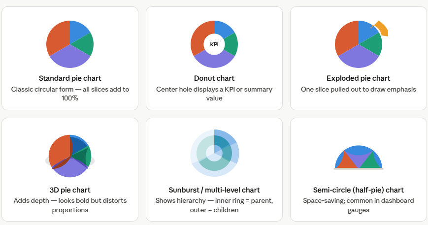
1. Standard pie chart
This is the classic, most widely recognized form. A simple circle divided into colored slices, each representing a category’s proportional share of the whole. It works best when you have a small number of clearly distinct categories (ideally five or fewer) and want an immediate visual impression of which categories dominate.
Best for: Budget breakdowns, market share, survey responses, demographic splits.
2. Donut chart (doughnut chart)
The donut chart is a pie chart with its center removed, creating a ring shape. Functionally, it communicates the same part-to-whole relationship, but the hollow center provides space to display a key metric — such as the total value, a headline percentage, or a KPI — making it especially popular in modern dashboard design.
Research from eagereyes.org suggests there is no significant difference in readability between a donut and a standard pie chart, so the choice between them is largely aesthetic and contextual.
Best for: Dashboard KPI displays, mobile-friendly visualizations, when you want to embed a summary number in the chart itself.
3. Exploded pie chart
In an exploded pie chart, one or more slices are pulled slightly away from the center of the circle to draw the viewer’s attention to a specific category. It’s a useful emphasis technique — but it comes with a cost. The physical separation makes it harder to visually assess proportions accurately, since the eye struggles to gauge the pulled-out slice relative to the rest of the pie. Use it sparingly and only when one category genuinely deserves singular focus.
Best for: Annual reports or presentations where you need to highlight one key finding.
4. 3D pie chart
The 3D pie chart adds depth and perspective to the standard circular form, making it look more dramatic and visually striking. However, it is almost universally criticized by data visualization experts — and for good reason. The perspective distortion caused by the three-dimensional view makes the front-facing slices appear larger than they actually are, actively misleading the reader about the true proportional data representation. Unless purely decorative, avoid it.
Best for: Nothing analytical. If a client insists, label every slice clearly with exact percentages.
5. Sunburst chart (multi-level pie chart)
The sunburst chart — sometimes called a multi-level or radial treemap — extends the pie chart concept into hierarchical data. The inner ring represents top-level categories, and each successive outer ring breaks those categories into subcategories. Think of it as a pie chart stacked inside another pie chart.
Best for: Organizational structures, file system usage, product category hierarchies, any data with parent-child relationships.
6. Semi-circle (half-pie) chart
A semi-circle chart uses only half the full 360° circle, presenting data in a D-shape. It saves vertical space and is frequently used in dashboards where real estate is limited. It is particularly common as a gauge chart for showing a single metric against a maximum value (like a progress bar in circular form).
Best for: Dashboard widgets, progress indicators, compact reporting layouts.
7. Polar area chart (rose chart)
Popularized by Florence Nightingale, the polar area chart differs from a standard pie chart in an important way: all slices have equal angles (like pizza slices of the same width), but their radius varies to represent value. Larger values extend further from the center. This makes it easier to compare many categories where some would produce near-invisible slices in a standard pie.
Best for: Cyclical data (monthly seasonality, wind direction frequency), showing magnitude variation across equally spaced categories.
When to Use a Pie Chart — With a Decision Framework
The pie chart is one of the most misused charts in data visualization precisely because it looks simple and familiar. Knowing when to reach for a pie chart — and when to put it back on the shelf — is one of the most valuable skills in data communication.
The right conditions for a pie chart
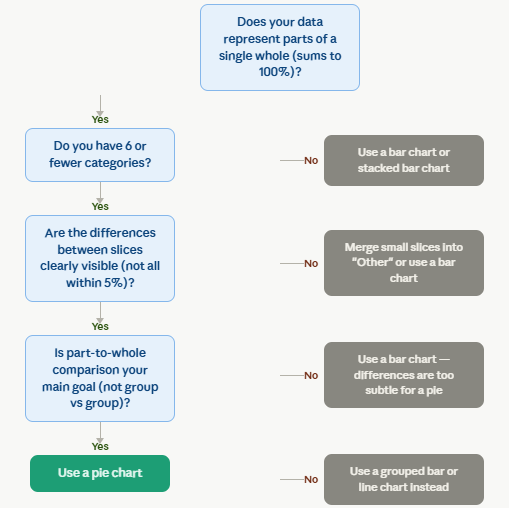
A pie chart earns its place in your analysis when all of the following conditions are true:
You are showing parts of a single whole
The data must represent categories that together make up 100% of one defined thing — total revenue, total respondents, total budget. If your slices don’t sum to a meaningful whole, a pie chart is the wrong tool.
You have five or fewer categories (six at most)
The more slices a pie chart has, the harder it becomes to distinguish them. Human perception struggles to accurately compare more than five or six angles simultaneously. Beyond that threshold, a bar chart almost always communicates the same information more clearly.
The differences between categories are visible
If all your values cluster within 5–10 percentage points of each other, the slices will be almost identical in size and your chart will be meaningless. Pie charts work best when there is a clear dominant slice or meaningful spread between categories.
Your audience is a general, non-technical audience
Pie charts are one of the most familiar chart types in the world. For public-facing reports, presentations to non-analysts, or media graphics, a pie chart communicates proportional data instantly — without requiring the reader to interpret an axis or scale.
Use this decision flowchart
Real-world use cases for pie charts
When used correctly, the pie chart is genuinely powerful. Here are the scenarios where it naturally excels:
Budget allocation
Showing how a company’s annual spend is divided across departments (R&D, marketing, operations, sales) is a textbook pie chart application. The audience immediately grasps which areas consume the largest share of resources.
Market share analysis
A pie chart showing that one brand holds 55% of market share in a category communicates dominance far more viscerally than a table of numbers.
Survey response distribution
Which payment method do you prefer?” with five options totaling 100% of respondents is an ideal pie chart use case. The distribution is clear, the whole is meaningful, and the audience is general.
Demographic composition
Showing the age group breakdown, gender distribution, or geographic mix of a user base or customer population works well when there are five or fewer segments.
Resource or time allocation
A freelancer’s breakdown of how they spent billable hours across clients, or a project manager’s view of how project phases consumed the total timeline, are both natural fits for a circular chart.
Real-World Pie Chart Examples Across Industries
The true power of a pie chart becomes clear when you see it applied to real problems in real contexts. Below are concrete, industry-specific examples that illustrate exactly where and how circle charts deliver genuine insight.

1. Business and finance
A CFO presenting annual expenditure to the board uses a pie chart for budget allocation to show that 40% of spend goes to operations, 25% to R&D, 25% to marketing, and 10% to administration. One glance tells every stakeholder where money is going — something a spreadsheet takes minutes to convey.
2. Marketing and digital analytics
Marketing teams use pie charts for traffic source analysis to show the percentage split between organic search, paid advertising, direct traffic, social media, and referrals. When organic drives 35% of all visits, a pie chart makes that dominance unmistakable.
3. Healthcare
Hospital administrators use pie charts in healthcare data to visualize the proportion of patients across diagnostic categories (cardiovascular, respiratory, neurological). This directly informs resource allocation and staffing ratios.
4. Politics and government
Election results and vote-share reporting are perhaps the most publicly visible pie chart use case. A pie showing one party with 54% of the popular vote against two smaller parties communicates the political landscape immediately.
5. E-commerce
An online retailer might use a sales distribution pie chart to show that electronics generate 40% of total revenue, followed by apparel at 20%, home goods at 15%, and beauty at 14%. This concentration insight is exactly what a pie chart is built for.
6. Education
A teacher can use a pie chart for grade distribution to show the proportion of students who achieved each grade band (A, B, C, D, F) across a cohort — a straightforward, immediately readable presentation for parents and administrators alike.
How to Read a Pie Chart — A Step-by-Step Guide
Many guides teach you how to build a pie chart — but very few explain how to read one properly. Misreading a pie chart is surprisingly easy, especially when slices are similar in size or when the chart is poorly designed. Here’s a clear, step-by-step process for interpreting a pie chart accurately.
Step 1: Identify what the whole represents
Before you look at a single slice, read the chart title. The title tells you what the entire circle represents — the 100%. Without understanding the whole, the parts are meaningless. For example, “Revenue by Region, FY 2024” tells you the circle = total annual revenue.
Step 2: Read the legend and labels
Scan the legend or the slice labels to understand what each color or segment represents. A well-designed circle chart will label slices directly; a poorly designed one forces you to match colors to a legend — which adds cognitive effort and room for error.
Step 3: Identify the largest and smallest slices
Your eye naturally gravitates to the biggest segment first — that is by design. Note which category dominates the whole and which is smallest. This gives you the headline story of the chart in under three seconds.
Step 4: Use percentage annotations for precision
The human eye is poor at estimating angles. Research has shown that we can reliably distinguish only a handful of proportions (roughly 1/2, 1/3, 1/4) from pie chart geometry alone. For everything else, rely on the percentage labels printed on or beside each slice. Never try to guess a proportion from slice size alone.
Step 5: Compare slices relative to the whole, not to each other
A pie chart is designed for part-to-whole comparison, not for direct group-to-group comparison. If you need to know whether Category A is twice as large as Category B, a bar chart will serve you better. From a pie, your main takeaway should always be: “This category represents X% of the total.”
Step 6: Draw one clear insight
A good pie chart always delivers one key message. What does this particular breakdown tell you? Who holds the majority? Is the distribution surprisingly even or surprisingly concentrated? Articulate the headline before you move on.
Common mistakes when reading pie charts
Assuming order implies ranking — Slices are not always arranged from largest to smallest. Don’t assume the first slice clockwise is the most important.
Comparing similar slices visually — If two slices look nearly the same size, don’t declare them equal without checking the labels. Even a 3–5 percentage point difference can be strategically significant.
Ignoring the sample size — A pie chart showing 60% prefer Product A means nothing if the sample was 10 people. Always note the total N that the whole represents.
How to Make a Pie Chart — Step-by-Step, with Tools
Knowing how to create a pie chart from scratch — whether by hand or using software — gives you full control over your data storytelling. Here’s how it works across different methods and tools.
The pie chart formula: the math first
Before any software touches your data, it helps to understand the underlying calculation. Given a dataset, two conversions are needed:
Percentage for each category:
(Category value ÷ Total value) × 100
Angle (in degrees) for each slice:
(Category value ÷ Total value) × 360
Example: If you are showing quarterly sales totaling $400,000, and Q1 contributed $120,000:
- Percentage: (120,000 ÷ 400,000) × 100 = 30%
- Angle: (120,000 ÷ 400,000) × 360 = 108 degrees
How to make a pie chart in Excel or Google Sheets
Both tools follow essentially the same process:
- Enter your category names in column A and their corresponding values in column B.
- Select both columns (highlight all data including headers).
- In Excel: go to Insert → Charts → Pie and choose your preferred pie chart style. In Google Sheets: go to Insert → Chart, then in the Chart Editor, select “Pie chart” from the chart type dropdown.
- Click on the chart to access formatting options — add data labels, choose colors, and add a title.
- Right-click a slice in Excel to access “Format Data Labels” and choose to display percentage, category name, or both.
Excel and Google Sheets are the fastest route for a quick pie chart and work well for standard business reporting.
How to make a pie chart in Tableau or Power BI
In Tableau: Drag your dimension to Color and your measure to Angle. Change the mark type to “Pie” in the Marks card. Tableau will automatically calculate proportions and render the chart.
In Power BI: Select the “Pie chart” visual from the Visualizations pane. Drag your category field to the Legend field and your value field to Values. Power BI handles all percentage calculations automatically and adds interactive tooltips.
No-code tools for quick pie charts
For non-technical users or design-forward outputs, Canva, Datawrapper, and Flourish are excellent options. All three offer drag-and-drop pie chart builders where you paste your data and the tool handles the rest. Datawrapper and Flourish produce particularly clean, web-embeddable interactive pie charts suitable for journalism, reports, and presentations.
Also Read: What is a Spider Chart
Pie Chart Best Practices & Design Tips
A technically correct pie chart and a well-designed pie chart are two very different things. The best pie chart design makes the key insight obvious in under five seconds, without requiring the reader to work for it. Here are the most important best practices, grounded in data visualization research.
Limit the number of slices to five or six
This is the single most important rule in pie chart design best practices. As the number of slices grows, the chart becomes harder to read — colors become harder to distinguish, thin slices become invisible, and the legend grows unwieldy. If you have more than six categories, group the smallest ones into a single “Other” slice colored in neutral gray. This keeps the chart clean while preserving the analytical value of the dominant categories.
Always include data labels and percentage annotations
The human eye cannot accurately estimate angles. Studies in data perception (notably work by Cleveland and McGill) have shown that humans judge angles and areas far less accurately than they judge position along a common scale — which is one reason bar charts are often more precise. To compensate, label every slice directly with its category name and percentage. Never force your reader to match a color to a legend and then estimate the slice size — that is two cognitive steps where zero should be needed.
Order slices intentionally
For most datasets, arrange slices from largest to smallest starting at the 12 o’clock position, moving clockwise. This ordering makes the dominant category immediately visible and gives the eye a logical reading path. The one exception: when your categories have an inherent order (such as Strongly Agree → Strongly Disagree on a Likert scale), preserve that logical sequence regardless of slice size.
Choose colors deliberately and accessibly
Use distinctly different hues for adjacent slices — never two shades of the same color side by side. More importantly, design for color accessibility: approximately 8% of men and 0.5% of women have some form of color vision deficiency. Avoid red-green combinations, and if possible, supplement color with a secondary cue such as direct labels or slice patterns. A well-designed pie chart color scheme works in grayscale as well as in full color.
Never use 3D effects, exploded slices without purpose, or stretched circles
These three habits are responsible for more misleading pie charts than any other cause. A 3D effect makes front-facing slices appear larger due to perspective distortion. An exploded slice looks larger than its true proportion because the gap creates the illusion of separation from the pack. A stretched or squashed circle turns circular slices into ovals, warping the area comparison entirely. Keep your pie chart visualization flat, round, and undistorted.
Label directly on the slice when space permits
Whenever a slice is large enough to contain text, label it directly inside the slice rather than relying on an external legend. This reduces the number of eye movements the reader needs to make. For very small slices, a callout line pointing from the label to the slice is the next best option. Reserve the legend exclusively for cases where direct labeling is truly impractical.
Here’s a quick visual summary of the most critical do’s and don’ts:

When NOT to Use a Pie Chart — Common Misuses
The pie chart is often blamed for being a bad chart. In reality, it is a good chart used badly. Knowing when to avoid it is just as important as knowing when to reach for it. Here are the most common scenarios where a pie chart fails — and what to use instead.
When your data doesn’t sum to 100%
The most fundamental misuse. If you have survey data where respondents could select multiple answers, the percentages add up to well over 100% — which makes a pie chart mathematically incoherent. A bar chart for multi-select data is the correct choice here.
When you have more than six categories
A pie with eight, ten, or twelve slices becomes a color identification puzzle rather than a data visualization. Readers spend more time matching legend entries to tiny slivers than understanding the data. Use a horizontal bar chart, which handles many categories gracefully.
When values are too similar
If five categories each hover around 18–22%, the pie slices will all look nearly identical. There is no insight to extract from a chart that looks like a uniform circle. A bar chart makes those small differences between groups visually clear via bar height — something angle comparison cannot achieve.
When you are comparing multiple groups over time
Pie charts have no time axis. If you want to show how a category’s share changed from 2022 to 2025, you need a line chart (for trends) or a grouped bar chart (for period-to-period comparison). Multiple pie charts placed side by side require your reader to memorize the first chart while looking at the second — a cognitive burden that almost always produces misreadings.
When you need precise comparisons between specific categories
If the key question is “Is Category A larger than Category B, and by how much?” the pie chart is the wrong answer. Human perception of angles is weak; bar length judgments are far more accurate. Reserve the pie for cases where the dominant story is “one category is much larger than others” — not fine-grained comparisons between similar-sized groups.
When negative values are present
A pie chart cannot represent negative numbers. If any category in your dataset has a negative value, the parts-to-whole model breaks down completely. Use a waterfall chart or a diverging bar chart instead.
When you have continuous data
Age, income, weight, or temperature are continuous variables — they don’t naturally snap into discrete, mutually exclusive buckets that add to 100%. Forcing them into a pie chart means you’ve made arbitrary bucketing decisions that shape the appearance of the chart more than the data does. A histogram is built for this.
Pie Chart vs. Other Chart Types — How to Choose
The pie chart rarely exists in a vacuum. Understanding how it stacks up against its alternatives helps you make the right visualization decision every time.
Pie chart vs. bar chart
This is the most common comparison in data visualization — and the answer is nuanced. A bar chart excels at comparing values between categories (how does A compare to B to C?) because humans read bar length along a common baseline far more accurately than they read slice angles. A pie chart, meanwhile, excels at communicating the dominant share of a whole (what fraction of the total does A represent?).
The practical rule: if your question is about proportion of a whole, use a pie. If your question is about how categories compare to each other, use a bar chart.
Pie chart vs. donut chart
The donut chart vs. pie chart debate is mostly aesthetic. Both communicate the same information with similar accuracy. The donut offers one functional advantage: the hollow center can display a summary metric (total value, a key percentage, or a label) without adding visual clutter. For dashboard design specifically, donuts tend to look cleaner and more modern. For traditional reports and presentations, the standard pie remains more familiar.
Pie chart vs. stacked bar chart
A stacked bar chart is arguably the strongest alternative to the pie chart for part-to-whole comparison — especially when you need to compare the proportional breakdown across multiple groups or time periods. A single stacked bar is essentially a pie chart unrolled into a rectangle, with the added benefit of a common baseline that makes comparisons easier. If you need to show how the composition changes year over year, a stacked bar chart is almost always the better choice.
Pie chart vs. waffle chart
The waffle chart (or square pie) represents 100% as a 10×10 grid of icons, with each icon representing 1%. It tends to be more readable than a pie chart for audiences who struggle with angle estimation, and it is especially effective in infographics and public-facing data journalism where visual engagement matters. Its limitation is rounding — values must be rounded to whole percentages to fill the grid cleanly.
Here’s a clear summary of when to use each:
| Scenario | Best chart |
|---|---|
| Showing one category’s share of a total | Pie chart |
| Comparing multiple categories to each other | Bar chart |
| Showing change in composition over time | Stacked bar chart or line chart |
| Displaying proportions for a general audience | Pie chart or waffle chart |
| Part-to-whole with a central KPI metric | Donut chart |
| Many categories (7+) in the same dataset | Horizontal bar chart |
| Hierarchical part-to-whole data | Sunburst chart |
| Two variables with continuous values | Scatter plot |
Advantages and Disadvantages of Pie Charts
Like any tool, the pie chart has a defined range of strengths and limitations. Understanding both helps you use it more deliberately.
Advantages of pie charts
Instantly intuitive — The pie chart is one of the most universally understood visualizations in the world. You don’t need a statistics background to grasp that the bigger the slice, the larger the share. This makes it uniquely powerful for communicating with broad, non-technical audiences.
Excellent for part-to-whole storytelling — No other chart type communicates the concept of a “share of the whole” as viscerally and immediately. When one category dominates, the pie chart makes that dominance unmistakable at a glance.
Visually engaging — Well-designed pie charts are compact, colorful, and visually appealing. In presentations, reports, and infographics, they draw the eye and invite engagement in a way that a table of numbers simply cannot.
Low data requirements — A pie chart needs only two columns of data: a category name and a numeric value. There are no axes to scale, no baselines to set. This simplicity makes it one of the fastest charts to create and one of the easiest to format.
Familiar to any audience — From school textbooks to The New York Times, pie charts appear everywhere. Their familiarity is a genuine advantage — readers don’t need to orient themselves to a new format before they can extract meaning.
Disadvantages of pie charts
Poor for precise comparison — Humans compare bar lengths far more accurately than slice angles. When two slices are close in size, most readers cannot reliably determine which is larger without reading the label. This is a fundamental perceptual limitation, not a design flaw.
Becomes unreadable with many categories — Beyond five or six slices, the circle chart turns into a visual puzzle. Small slices become nearly invisible, and the number of distinct colors needed exceeds what most people can comfortably track.
Cannot show change over time — There is no temporal dimension in a pie chart. If your data changes month over month, a pie chart gives you only one moment — it cannot tell the story of how that moment came to be or where it is heading.
Only represents one dataset at a time — You cannot stack, group, or layer pie charts in the way you can with bar or line charts. Comparing two pie charts side by side forces readers to hold one chart in memory while looking at the other — a cognitive demand that leads to misinterpretation.
Susceptible to design distortion — 3D effects, exploded slices, and non-standard starting angles can all make a pie chart actively misleading. No other common chart type is as vulnerable to these distortions.
Conclusion
The pie chart is not a perfect visualization — no chart type is. But used within its proper scope, it remains one of the most powerful and universally understood tools in the entire data visualization toolkit. Its strengths are real and specific: showing a dominant share of a whole, communicating proportional data to a broad audience, and delivering a single clear insight at a glance.
The key is knowing the rules. Limit your slices. Label everything. Keep it flat. Choose it when the story is about proportion — and reach for a bar chart, stacked bar, or line chart when it isn’t.
At Algoscale, we help organizations turn raw data into clear, actionable insights — whether that’s through well-designed dashboards, business intelligence solutions, or custom data visualization strategies. If you’re looking to make better sense of your data, our team is ready to help.
Frequently Asked Questions About Pie Charts
What does a pie chart show?
A pie chart shows how a total amount is divided among categories, with each slice representing one category’s proportional share of the whole. The complete circle always equals 100% of the total.
How many slices should a pie chart have?
Most data visualization experts recommend a maximum of five to six slices. Beyond this threshold, the chart becomes difficult to read and the smallest slices become nearly impossible to distinguish. If you have more categories, merge the smallest into an “Other” slice or switch to a bar chart.
What is the difference between a pie chart and a bar chart?
A pie chart shows each category’s share of a total (part-to-whole). A bar chart compares values across categories (group-to-group). Use a pie when proportion is the story; use a bar chart when comparison between specific categories is the priority.
Can a pie chart have negative values?
No. Pie charts require all values to be positive and to sum to a meaningful whole. Negative values make the part-to-whole model mathematically incoherent. Use a waterfall chart or diverging bar chart for data containing negative values.
What is an exploded pie chart?
An exploded pie chart is a variant where one or more slices are pulled slightly away from the center of the circle to emphasize a specific category. While it draws attention effectively, it can distort the perceived proportion of the extracted slice and should be used sparingly.
Is a donut chart the same as a pie chart?
A donut chart is a direct variant of the pie chart — it uses the same data and communicates the same proportional information, but removes the center of the circle, creating a ring shape. The main functional difference is that the hollow center can display a summary metric or label.
What software is best for making pie charts?
For business users, Microsoft Excel and Google Sheets are the fastest options. For data analysts, Python (Matplotlib or Plotly) and R (ggplot2) offer the most control. For dashboards and BI reporting, Tableau and Power BI are industry standards. For design-forward outputs, Canva, Datawrapper, and Flourish are excellent no-code choices.
Why do some data experts say to never use pie charts?
Critics of the pie chart — most notably data visualization researcher Stephen Few — argue that humans are fundamentally poor at judging angles and areas compared to lengths, making pie charts less accurate for comparison than bar charts. While this is a valid perceptual argument, the pie chart’s strength lies not in precision but in communicating a dominant share to a broad audience quickly. Used correctly, it remains a valuable tool.