

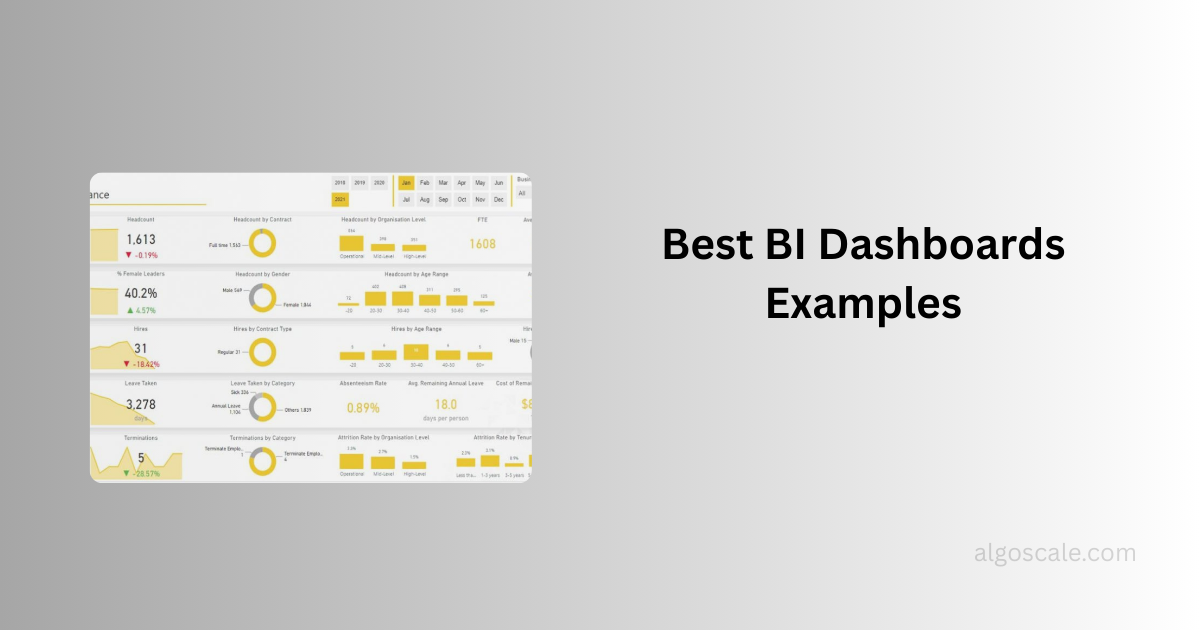

“Without data, you’re just another person with an opinion.”- W. Edwards Deming
Now imagine having thousands of rows of data but no clear way to understand them. That’s the reality many businesses face today.
You typically have about five seconds.
Yes, most business leaders decide whether your report is useful or not in under five seconds. If the information is not clear, they move on immediately. A well-designed business intelligence dashboard should be able to provide anyone looking at the dashboard with the most critical and actionable information in just 5 seconds.
They need clear, visual insights that tell a story instantly. This is where the business intelligence (BI) dashboard becomes incredibly useful and valuable. Instead of manually analyzing raw data, dashboards help you to convert complex datasets into visual elements like charts, graphs, and real-time indicators.
In fact, 78% of executives now rely on dashboards to monitor business performance and make decisions.
So, what is a dashboard in business intelligence?
To be clear, it’s a centralized visual interface that displays key data, metrics, and trends so teams can monitor performance and make informed decisions very quickly. From marketing, sales, to finance and operations, dashboards will help businesses to track what matters most without digging through countless data tables.
Today, companies across industries are investing heavily in analytics platforms such as Microsoft Power BI, Tableau, and Looker Studio to build dashboards that turn data into actionable insights.
In this guide, we’ll explore real business intelligence dashboard examples across industries, break down what makes them effective, and show how different departments use dashboards to monitor performance, detect trends, and make smarter decisions with data.
Before moving into the types of dashboards, let’s see why dashboards matter more than ever.
The volume of data businesses generate today is enormous. Without proper visualization, valuable insights can easily get lost in spreadsheets or complex reports. All your team members do is stare at the Excel sheet cluelessly.
That’s why organizations are adopting sample business intelligence dashboards that focus on specific goals, whether it’s improving sales performance, monitoring customer behavior, or optimizing operations.
Throughout this article, you’ll see practical business intelligence dashboard examples used in real businesses.
Why Dashboards Matter More Than Ever?
The volume of business data being generated today is massive and it’s growing rapidly.
Without proper visualization, valuable insights can easily get overlooked inside spreadsheets and static reports. Many teams spend hours staring at these excel sheets filled with numbers, trying to figure out what the data actually means.
That’s why companies are increasingly adopting business intelligence dashboards designed around specific goals, whether it’s improving sales performance, analyzing customer behavior or optimizing operations.
A great example of this is Netflix, which relies heavily on analytics dashboards to monitor viewer behavior and content performance. With hundreds of millions of subscribers worldwide, Netflix uses data dashboards to analyze engagement metrics such as watch time, completion rates, and user preferences. These insights help the company decide which shows to promote, renew, or produce, making dashboards a core part of its data-driven content strategy.
Let us help you discover practical BI dashboard examples used in real organizations, along with the metrics and insights they help teams monitor.
Recent industry research shows that 68% of organizations now use digital dashboards for real-time data visualization, and 72% of Fortune 500 companies rely on dashboard tools for analytics and reporting.
What Makes a Good BI Dashboard?
A dashboard is only useful if people can understand it quickly and act on the information it provides.
In the context of Business Intelligence, a dashboard isn’t just a collection of charts. It is a carefully designed interface that highlights the most important data points, tracks performance, and helps teams make faster decisions.
A well-designed business intelligence dashboard simplifies your complex datasets and turns them into visual insights, data that tells a story.
But not every dashboard works well.
Some dashboards overwhelm users with too many charts, while others fail to show the right metrics. The most effective dashboards focus on clarity, relevance, and actionability so users can immediately identify what is working and what needs attention.
Now, let’s look at some practical business intelligence dashboards examples used across different industries and explore the metrics and insights that each one delivers.
1. Executive Overview Business Intelligence Dashboard
“If you can’t see the whole business in one place, you’re not really managing it – you’re reacting to it.”
That’s exactly why executive dashboards exist.
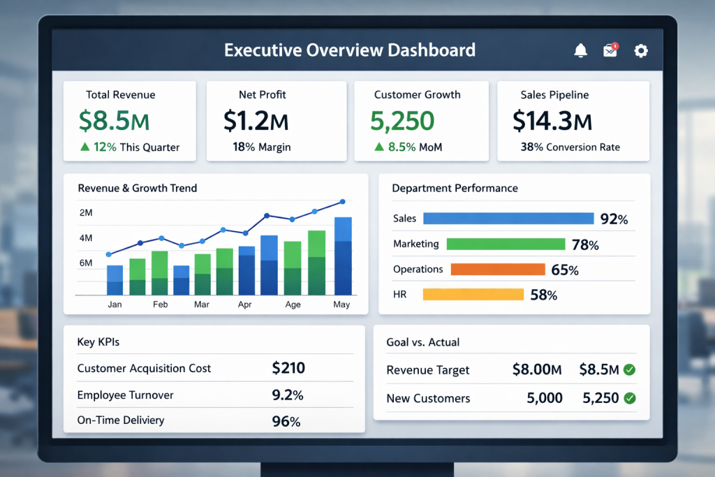
Leaders don’t have time to dig through multiple reports from finance, sales, and operations. An executive overview dashboard pulls the most important company metrics into a single screen, giving decision-makers an instant understanding of business performance.
What leaders typically monitor
- Total revenue and profit trends
- Company growth rate
- Department performance comparison
- Strategic KPI performance
What this dashboard quickly answers
- Are we hitting revenue targets this quarter?
- Which departments are driving growth?
- Is the overall business performance improving or declining?
Typical dashboard visuals
- KPI summary cards
- Revenue trend charts
- Department comparison bars
- Goal vs actual indicators
Teams often build these executive dashboards using platforms like Microsoft Power BI, which allows leadership teams to track multiple KPIs from different data sources in one unified view.
2. Sales Performance Business Intelligence Dashboard
72% of sales leaders say real-time pipeline visibility directly impacts revenue forecasting.
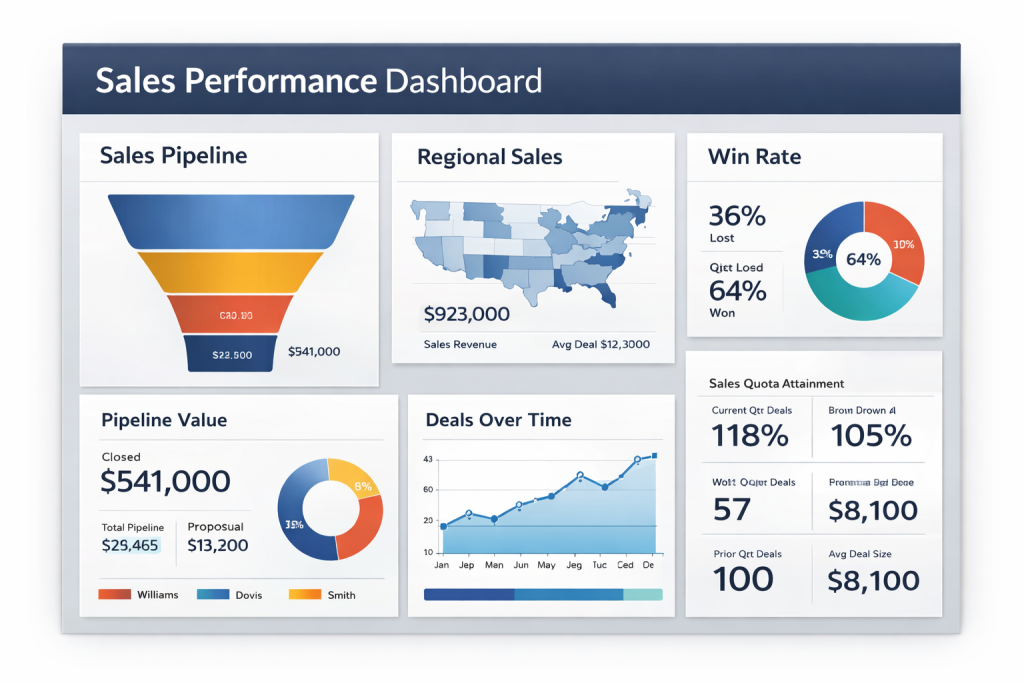
That’s why sales teams rely heavily on a sales performance dashboard. Instead of juggling CRM reports, spreadsheets, and emails, this dashboard shows pipeline health, conversions, and revenue progress in one view.
What sales teams keep an eye on
- total deals in the pipeline
- lead-to-opportunity conversion rate
- closed-won revenue
- average deal size
- sales cycle length
Useful visual elements
- sales funnel visualization
- pipeline stage breakdown
- quota vs achievement chart
- Regional revenue comparison
Sales teams often create performance dashboards with Tableau to track pipeline activity, deal conversions, and regional sales trends.
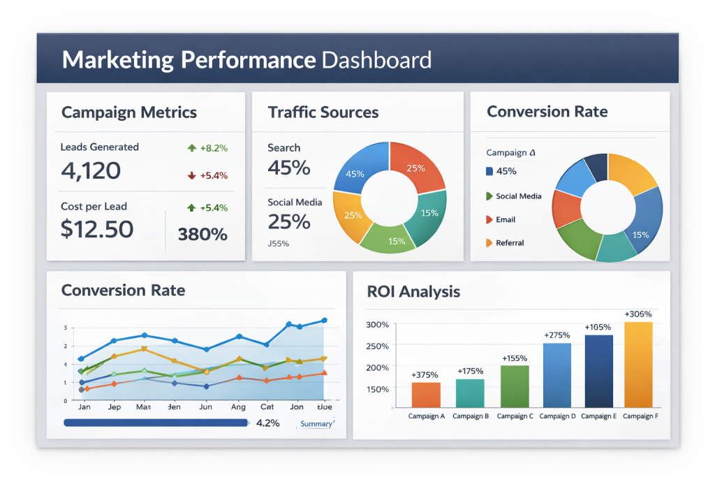
3. Marketing Performance Business Intelligence Dashboard
Where is your marketing budget actually generating revenue?
That’s the question marketing leaders constantly try to answer. A marketing BI dashboard connects campaign data, traffic sources, and conversion metrics so teams can clearly see which channels are driving real business impact.
Key metrics marketers track
- campaign ROI
- cost per lead
- website conversion rate
- channel performance (SEO, paid ads, social)
- marketing-attributed revenue
What marketers instantly learn
- Which campaigns are profitable
- where leads are coming from
- Which channels deserve more budget
Marketing teams frequently use Looker Studio to visualize campaign performance, traffic sources, and conversion metrics in real time.
4. Financial Business Intelligence Dashboard
Imagine preparing for a quarterly board meeting and needing to answer questions about profitability, expenses, and revenue trends within seconds.
A financial dashboard helps finance teams present exactly that, a clear picture of the company’s financial health without digging through accounting reports.
Metrics usually included
- revenue vs expenses
- profit margins
- operating costs
- cash flow trends
- budget vs actual spending
Typical visuals
- profit margin charts
- expense breakdown pie charts
- revenue trend graphs
- budget tracking indicators
Finance departments commonly build financial dashboards using Microsoft Power BI to monitor revenue, expenses, profitability, and budget performance.

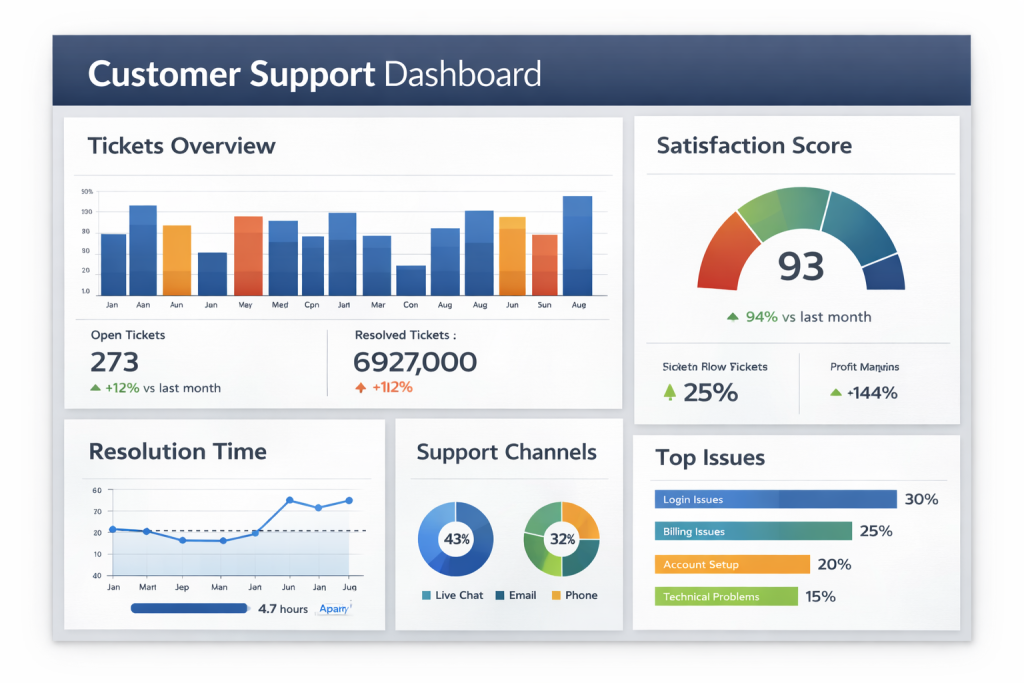
5. Customer Support Business Intelligence Dashboard
Every support team has the same challenge: keeping customers happy while handling thousands of tickets.
A customer support dashboard gives teams a real-time snapshot of how well they’re managing customer issues and response times.
Support teams typically monitor
- number of open tickets
- average response time
- ticket resolution rate
- customer satisfaction score (CSAT)
- support volume trends
What this dashboard helps improve
- faster issue resolution
- better workload management
- improved customer experience
Customer support analytics dashboards are often developed with Domo, which integrates service data and visualizes ticket performance metrics.
6. Operations Business Intelligence Dashboard
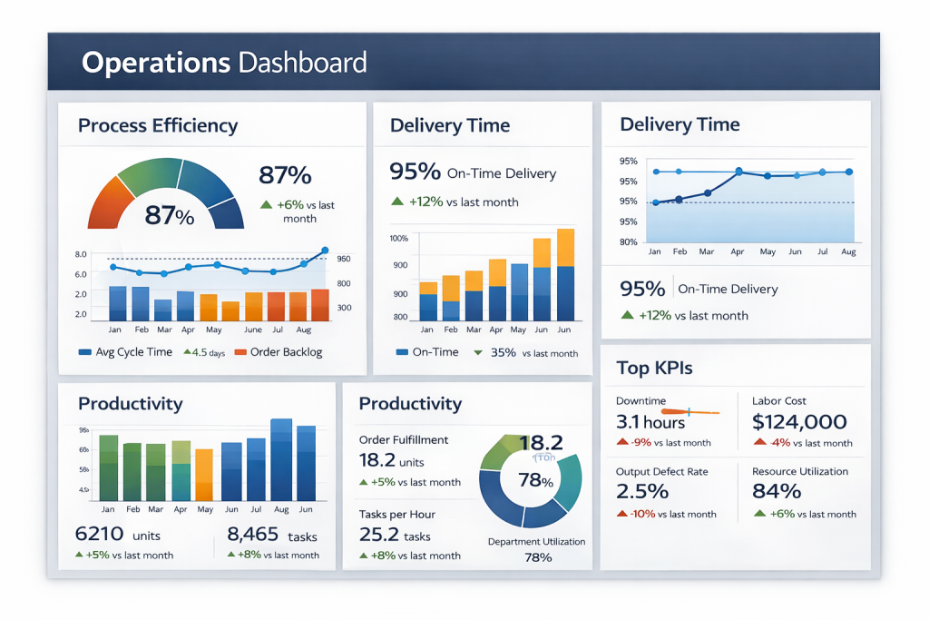
Behind every successful business is an operations team quietly ensuring everything runs smoothly.
An operations dashboard focuses on efficiency, productivity, and resource utilization, helping companies identify bottlenecks in processes.
Operational insights are typically shown
- production or service output
- process efficiency metrics
- delivery timelines
- inventory levels
- resource utilization
Key visuals are often included
- workflow performance charts
- operational KPI cards
- supply chain status indicators
Operations teams frequently rely on platforms like Qlik Sense to monitor operational performance and uncover process improvements.
7. HR Analytics Business Intelligence Dashboard
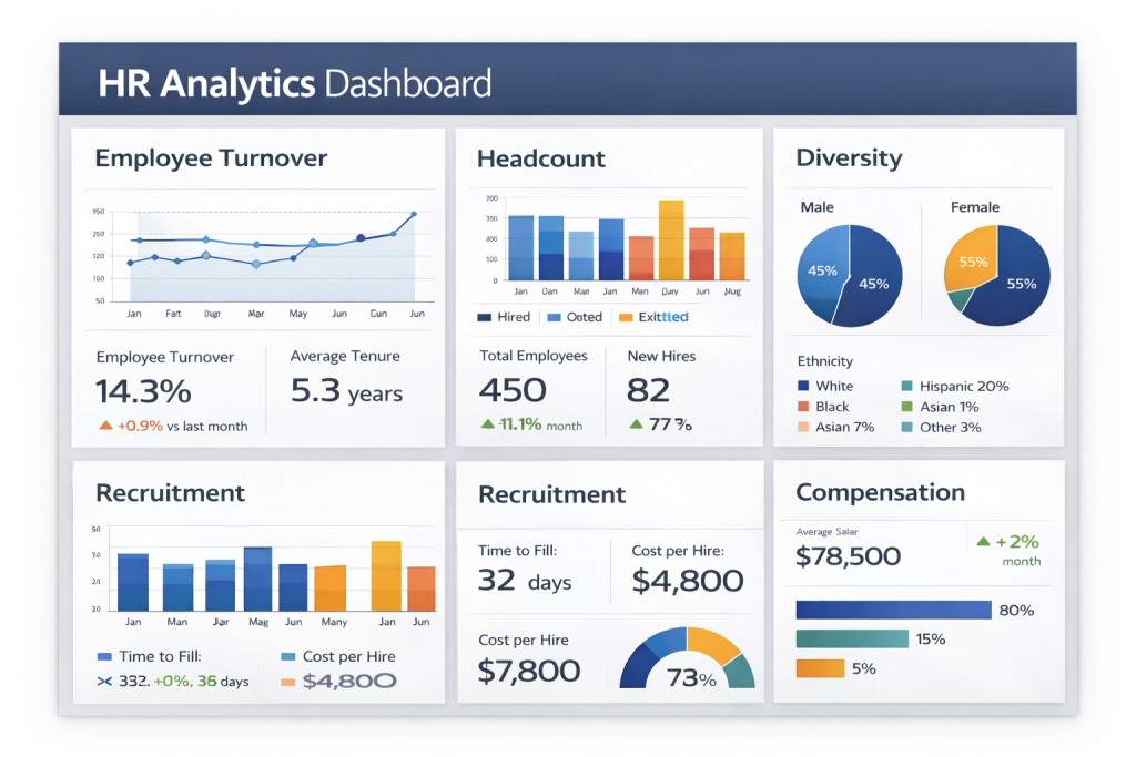
People’s decisions are becoming increasingly data-driven. In fact, organizations that actively use analytics for workforce decisions are significantly more likely to outperform competitors in productivity and profitability.
That’s why HR leaders rely on HR analytics dashboards to connect hiring data, employee engagement metrics, and retention insights into one view.
Signals HR teams track
- employee turnover rate
- time-to-hire
- workforce productivity
- diversity metrics
- engagement survey scores
HR teams use Tableau dashboards to analyze workforce metrics such as employee turnover, hiring performance, and engagement trends.
8. Product Performance Business Intelligence Dashboard
A product team launches dozens of features every year, but which ones actually deliver value?
A product performance dashboard answers that question by tracking how users interact with the product.
Key insights product managers watch
- active users
- feature adoption rate
- product engagement trends
- user retention
- churn linked to product usage
Product analytics dashboards are often built with Looker to track feature usage, user engagement, and product adoption metrics.

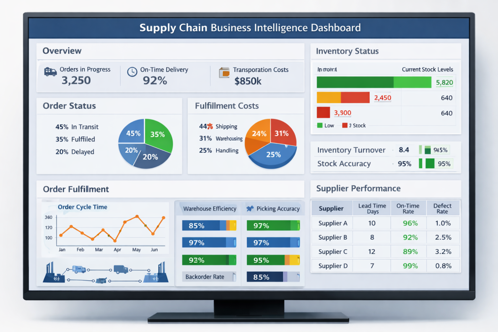
9. Supply Chain Business Intelligence Dashboard
A delayed shipment can ripple through the entire supply chain.
That’s why companies rely on supply chain dashboards to monitor logistics, supplier performance, and inventory movement in real time.
Operational metrics are typically monitored
- inventory turnover
- supplier delivery times
- logistics delays
- order fulfillment rate
- warehouse performance
Supply chain analytics dashboards are commonly created using Qlik Sense to visualize inventory levels, supplier performance, and logistics efficiency.
10. E-Commerce Business Intelligence Dashboard
Here’s something every online retailer should know:
Data-driven companies are 23× more likely to acquire customers and 6× more likely to retain them compared to organizations that rely less on analytics.
An e-commerce dashboard helps businesses turn website data into actionable insights.
Metrics e-commerce teams watch daily
- conversion rate
- average order value
- cart abandonment rate
- top-selling products
- traffic sources
Online retailers frequently use Looker Studio dashboards to track website traffic, conversion rates, and online sales performance.
Did You Know?
Real-world companies are already using dashboards at massive scale.
For example, Amazon processes millions of transactions every day across its global e-commerce platform. To manage this scale, Amazon relies on internal business intelligence dashboards to track product demand, monitor inventory levels, analyze delivery performance, and understand customer behavior in real time.
Pro tip: If you’re evaluating BI platforms, studying real Looker Studio dashboard examples is one of the easiest ways to see how data storytelling works in practice.

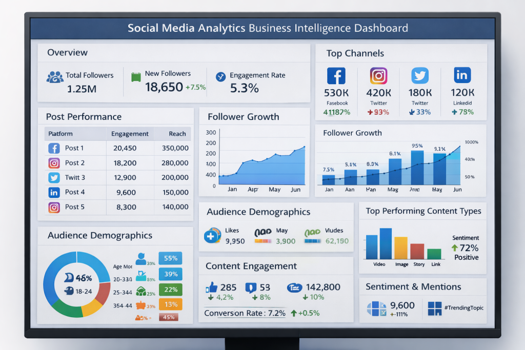
11. Social Media Analytics Business Intelligence Dashboard
Every like, comment, and share tells a story about your brand.
But without a structured dashboard, social media data quickly becomes overwhelming.
A social media analytics dashboard highlights what content resonates with audiences and which campaigns drive engagement.
Common performance indicators
- engagement rate
- follower growth
- impressions and reach
- top performing content
- audience demographics
Marketing teams often build social media analytics dashboards with Domo to monitor engagement, audience growth, and content performance.
12. Customer Retention Business Intelligence Dashboard
Customer acquisition may grab the headlines, but retention drives profitability.
Organizations that adopt data-driven strategies are significantly more likely to retain customers and increase long-term revenue.
A customer retention dashboard focuses on understanding loyalty patterns.
Retention signals that companies analyze
- customer churn rate
- repeat purchase rate
- subscription renewals
- customer lifetime value
- loyalty program engagement
Customer retention dashboards are commonly created using Looker to analyze churn patterns and long-term customer value.

13. Project Management Business Intelligence Dashboard
Managing projects without data visibility often leads to missed deadlines and budget overruns.
A project management dashboard provides a real-time overview of project progress, resource allocation, and milestone completion.
Typical project KPIs
- project completion status
- milestone tracking
- team workload
- budget utilization
- task progress
Project managers frequently use Tableau dashboards to track project progress, milestones, and resource utilization.

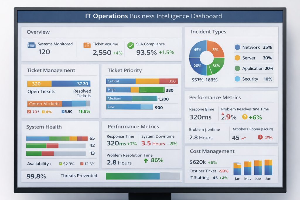
14. IT Operations Business Intelligence Dashboard
IT teams are responsible for keeping the digital infrastructure running 24/7.
An IT operations dashboard consolidates infrastructure data so teams can quickly detect performance issues and prevent outages.
Infrastructure metrics monitored
- server uptime
- system response time
- network performance
- incident resolution time
- security alerts
IT operations dashboards are often built with Domo to monitor system uptime, performance metrics, and incident trends.
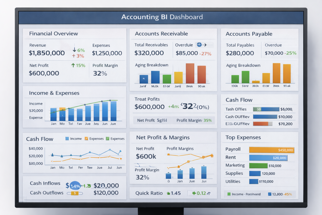
15. Accounting BI Dashboard
Accounting teams deal with numbers all day, but raw numbers alone don’t reveal much.
An accounting BI dashboard transforms financial data into clear visual insights so finance teams can quickly understand the company’s financial health without digging through spreadsheets or lengthy reports.
Instead of manually reviewing accounting records, this dashboard highlights key financial indicators that help organizations monitor cash flow, track outstanding invoices, and manage expenses more effectively.
Key metrics typically included
- accounts receivable and payable
- revenue vs expenses
- outstanding invoices
- cash flow trends
- tax and compliance indicators
Accounting teams often build these dashboards using Microsoft Power BI to combine financial data from accounting systems and visualize real-time financial performance.
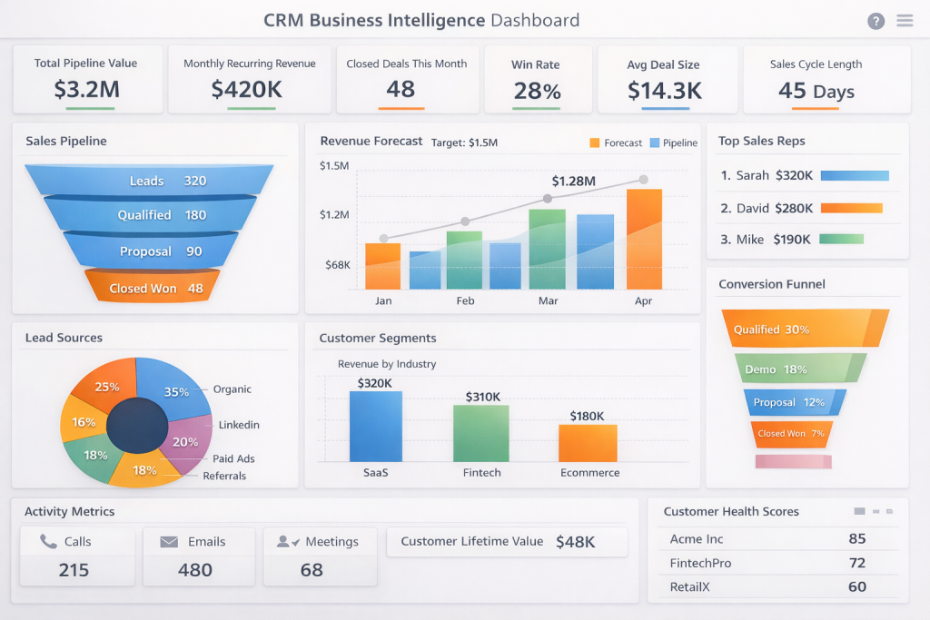
16. CRM Business Intelligence Dashboard
Every interaction with a customer creates valuable data — emails, sales calls, support tickets, and purchases.
A CRM BI dashboard brings all this information together so businesses can understand how customer relationships are evolving and where sales opportunities exist.
Instead of manually reviewing CRM records, this dashboard allows teams to track lead progress, analyze customer engagement, and monitor sales pipeline performance.
Insights typically displayed
- lead generation trends
- sales pipeline stages
- deal conversion rates
- customer acquisition metrics
- account activity and engagement
Organizations frequently visualize CRM analytics using Tableau, which integrates customer data sources and turns them into interactive dashboards.
17. LTV Business Intelligence Dashboard
Some customers make a single purchase and disappear. Others continue buying for years.
A Customer Lifetime Value (LTV) dashboard helps businesses understand the long-term value of their customers by analyzing purchasing behavior, retention patterns, and revenue contribution over time.
By tracking LTV, organizations can identify their most valuable customer segments and design better retention strategies.
Key metrics analyzed
- customer lifetime value
- repeat purchase rate
- retention rate
- average revenue per customer
- churn trends
Customer analytics teams frequently use Looker to build dashboards that analyze customer behavior and long-term revenue patterns.

18. Qlik Sense C-Suite Dashboard
Executives don’t need dozens of charts; they need clarity and quick insights.
A C-suite dashboard focuses on high-level strategic metrics that help leadership teams understand overall business performance in seconds.
These dashboards are designed to provide a quick overview of company health, highlighting revenue growth, operational performance, and strategic KPIs.
Insights typically included
- company revenue growth
- profit margins
- operational performance metrics
- department performance comparisons
- progress toward strategic goals
Leadership teams often rely on Qlik Sense to build executive dashboards that present business insights in a highly interactive and easy-to-understand format.

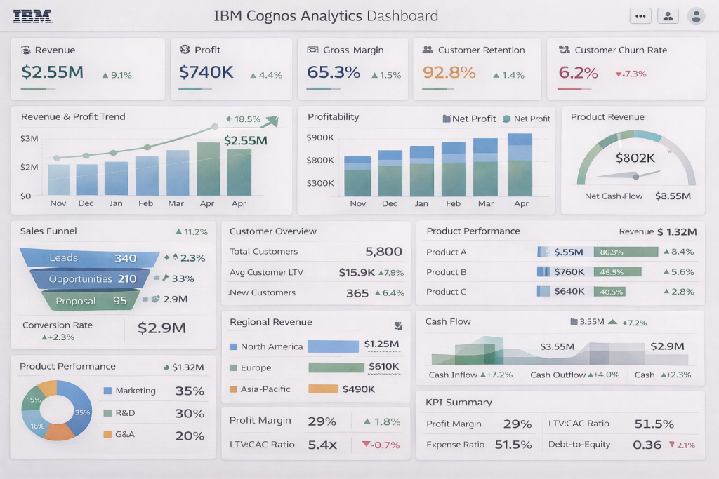
19. IBM Cognos Analytics Dashboard Suite
Large enterprises often need dashboards that can analyze data from multiple departments, systems, and business units simultaneously.
The IBM Cognos analytics dashboard suite provides advanced reporting and visualization capabilities that allow organizations to monitor enterprise-wide performance and uncover deeper insights.
These dashboards are typically used by large organizations that require powerful analytics tools to manage complex datasets.
Common analytics areas covered
- financial performance tracking
- operational analytics
- enterprise KPIs
- predictive forecasting insights
- cross-department performance metrics
Enterprise analytics teams often complement such enterprise reporting environments with modern BI visualization tools to unify data and create interactive dashboards.
BI Dashboards Comparison Overview
| Dashboard Type | Primary Use Case | Key Metrics Tracked | Common Users | BI Tool Example |
| Executive Overview Dashboard | Monitor overall company performance | Revenue growth, profit margin, strategic KPIs | CEO, CFO, leadership teams | Power BI |
| Sales Performance Dashboard | Track sales pipeline and revenue performance | Pipeline value, deal conversion rate, sales quota | Sales managers, sales teams | Tableau |
| Marketing Performance Dashboard | Measure marketing campaign effectiveness | Campaign ROI, leads generated, conversion rate | Marketing managers | Looker Studio |
| Financial Dashboard | Monitor financial health of the organization | Revenue, expenses, profit margin, budget variance | Finance teams, CFOs | Power BI |
| Customer Support Dashboard | Analyze support performance and service quality | Ticket resolution time, CSAT score, open tickets | Support teams, customer success | Domo |
| Operations Dashboard | Track operational efficiency and processes | Process efficiency, delivery time, productivity | Operations managers | Qlik Sense |
| HR Analytics Dashboard | Analyze workforce performance and hiring metrics | Employee turnover, time-to-hire, engagement score | HR teams | Tableau |
| Product Performance Dashboard | Track product usage and adoption | Active users, feature adoption, user engagement | Product managers | Looker |
| Supply Chain Dashboard | Monitor inventory and logistics operations | Inventory levels, delivery time, supplier performance | Supply chain managers | Qlik Sense |
| E-Commerce Dashboard | Analyze online store performance | Website traffic, conversion rate, average order value | E-commerce managers | Looker Studio |
| Social Media Dashboard | Measure social media engagement | Reach, engagement rate, follower growth | Social media managers | Domo |
| Customer Retention Dashboard | Understand customer loyalty and churn | Retention rate, churn rate, repeat purchases | Customer success teams | Looker |
| Project Management Dashboard | Track project progress and team productivity | Task completion rate, milestone status, resource usage | Project managers | Tableau |
| IT Operations Dashboard | Monitor system performance and infrastructure | Server uptime, response time, system alerts | IT teams | Domo |
| Customer Experience Dashboard | Analyze overall customer satisfaction | NPS, CSAT, feedback trends | CX teams | Looker |
| Marketing Attribution Dashboard | Understand which channels drive conversions | Channel ROI, attribution paths, campaign contribution | Marketing analysts | Looker Studio |
| Accounting Dashboard | Monitor financial transactions and cash flow | Cash flow, receivables, payables | Accounting teams | Power BI |
| CRM Dashboard | Track customer relationships and sales activity | Lead activity, pipeline value, customer engagement | Sales and CRM teams | Tableau |
| LTV Dashboard | Measure long-term customer value | Customer lifetime value, repeat purchase rate | Growth teams | Looker |
| C-Suite Dashboard | Provide strategic overview for executives | Revenue growth, operational KPIs, company performance | Executive leadership | Qlik Sense |
| Enterprise Analytics Dashboard | Consolidate insights across departments | Enterprise KPIs, financial performance, operational data | Business leaders | Domo |
Business Intelligence Dashboard Tools in 2026
Modern businesses rely on powerful business intelligence consulting services to transform their raw data into meaningful insights. While dashboards can be built in many analytics environments, certain BI tools have become industry standards because of their strong data integration, visualization capabilities, and scalability. Below are some of the most widely used business intelligence dashboard tools businesses rely on in 2026.
Microsoft Power BI
This always remains as one of the most popular business tools for building interactive dashboards and reports. Why so? Because of its seamless integration with Microsoft products such as Excel, Azure, and SQL Server, it is a natural choice for organizations already using the Microsoft ecosystem.
Power BI consulting services allows businesses to connect multiple data sources, create real-time dashboards, and share insights across teams. Its drag-and-drop interface and strong visualization capabilities make it suitable for both analysts and business users. It’s cost-effective too.
Tableau
This is widely recognized for its advanced data visualization capabilities and interactive dashboards. It enables users to explore complex datasets through intuitive charts, maps, and visual storytelling features.
Compared to Power BI, Tableau provides advanced visualization dashboards with a deep learning curve, and businesses hire Tableau developers when they need powerful visual analytics and deep data exploration capabilities.
Domo
Domo is a cloud-based BI platform designed for real-time business monitoring. It connects data from multiple sources and provides live dashboards that help organizations track performance instantly.
Many companies prefer Domo for its ability to bring together operational data, marketing metrics, and financial insights into a single unified dashboard.
Looker Studio
Looker Studio, formerly known as Google Data Studio, is a free dashboarding tool commonly used for marketing and web analytics reporting. It integrates easily with Google services such as Google Analytics, Google services such as Google Analytics, Google Ads, and BigQuery.
This makes it particularly useful for organizations that rely heavily on digital marketing data for online performance tracking.
Qlik Sense
Qlik Sense is known for its powerful associative data engine that allows users to explore relationships between datasets without predefined queries. This enables deeper data exploration and more flexible analytics.
Businesses often use Qlik Sense for advanced analytics and executive dashboards discovering hidden patterns in data is needed.
Looker
Looker, now part of Google Cloud, focuses on modern data exploration and embedded analytics. It allows companies to build dashboards directly on top of their data warehouse and embed analytics into applications. This tool is a popular choice for enterprise business intelligence, having an advanced data infrastructure.
Conclusion
The examples in this guide highlight an important reality: a business intelligence dashboard is only as powerful as the data foundation behind it.
Many organizations attempt to build dashboards quickly, but without properly structured data pipelines, well-designed data models, and clearly defined KPIs, even the most visually appealing dashboards fail to deliver meaningful insights.
Successful BI implementations require more than just visualization tools. They depend on robust data architecture, scalable analytics infrastructure, and thoughtful dashboard design that aligns with real business objectives.
This is where companies often need specialized expertise.
At Algoscale, we work with organizations to build end-to-end analytics ecosystems that power reliable business intelligence dashboards. Our teams help design modern data platforms, implement scalable data pipelines, and develop dashboards that allow leadership teams to monitor performance with clarity and confidence.
From building enterprise data warehouses and data lake architectures to implementing dashboards in platforms like Microsoft Power BI, Tableau, and Looker, Algoscale helps organizations transform complex data environments into actionable intelligence.
The goal is not just to build dashboards, it is to create analytics systems that support faster, more reliable decision-making across the business.
As companies continue to generate larger volumes of data, the ability to convert that data into clear insights will increasingly define competitive advantage. Organizations that invest in well-structured data platforms and thoughtfully designed business intelligence dashboards will be far better equipped to make strategic decisions in a rapidly evolving market.
Frequently Asked Questions
1. What is a business intelligence dashboard?
A business intelligence dashboard is a visual interface that displays key metrics, KPIs, and trends from multiple data sources in one place. It helps organizations monitor performance, analyze data quickly, and make informed decisions using charts, graphs, and real-time indicators.
2. What are the different types of business intelligence dashboards?
Business intelligence dashboards are typically categorized into three main types:
- Strategic dashboards – used by executives to track high-level KPIs and long-term goals.
- Operational dashboards – monitor day-to-day business activities such as sales, support tickets, or production metrics.
- Analytical dashboards – help analysts explore complex datasets to identify trends, patterns, and insights.
Each type serves different users across the organization.
3. What are the key metrics included in a BI dashboard?
The metrics in a business intelligence dashboard depend on the department using it, but commonly tracked KPIs include:
- Revenue and profit trends
- conversion rates
- customer acquisition metrics
- operational efficiency indicators
- customer satisfaction scores
- product usage metrics
Effective dashboards focus only on the most actionable metrics.
4. What tools are commonly used to build business intelligence dashboards?
Several analytics platforms are widely used to create BI dashboards, including:
- Microsoft Power BI
- Tableau
- Looker and Looker Studio
- Qlik Sense
- Domo
- IBM Cognos Analytics
These tools allow businesses to connect multiple data sources and transform raw data into interactive dashboards.
5. How does a BI dashboard help businesses make better decisions?
BI dashboards help businesses make faster and more informed decisions by presenting complex data in a visual format. Instead of analyzing spreadsheets or raw reports, decision-makers can quickly identify trends, track KPIs, detect problems, and respond to changes in real time.
6. What is the difference between a report and a dashboard in business intelligence?
A report usually provides detailed data analysis for a specific time period, while a dashboard displays key metrics in a visual format for quick monitoring. Dashboards are designed for real-time insights and ongoing performance tracking, whereas reports are often used for deeper analysis.
7. What makes an effective business intelligence dashboard?
An effective BI dashboard focuses on clarity, relevance, and usability. It should display the most important KPIs, use clear visualizations, update data regularly, and allow users to quickly understand business performance without navigating complex reports.
8. Why are business intelligence dashboards important for modern organizations?
Modern organizations generate large volumes of data across departments. Business intelligence dashboards help convert this data into actionable insights, enabling teams to monitor performance, detect trends, optimize operations, and make strategic decisions based on real data rather than assumptions.